¶ The Laboratorium (3d ser.)
A blog by James Grimmelmann
Soyez réglé dans votre vie
et ordinaire comme un bourgeois
afin d'être violent et original dans vos oeuvres.
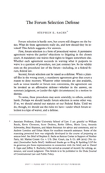
A Master Class in Law-Review Typography, Courtesy of Steve Sachs
Steve Sachs has just uploaded a new paper, The Forum-Selection Defense, to SSRN. Others can weigh in on his argument that “forum selection is a type of waiver, and a defense.” (It strikes me as right, but I know that I’m out of my depth in this corner of civil procedure.) I’d like to talk instead about something else on display in Steve’s work: superlative typography. His draft is a visual guide to best practices in law-review-article design.
Disclaimer: Steve is a friend. We have known each other since law school and we have corresponded about typography. He graciously answered several questions about his template as I was drafting this post.
This is an interactive demonstration. Click the images for larger versions.
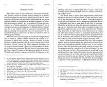
First, and most blatantly, this isn’t a standard 8.5″ × 11″ page. Instead, it’s 5.24″ × 8.63″. This is small, smaller even than a typical law-review page. But it works. The print is a reasonable size for reading: 11.5-point body text and 9-point footnotes. Thin pages mean narrow text blocks, so even the footnotes have comfortably short lines. The margins are small, too: less than half an inch. Small pages with small margins are ideal for reading on a computer screen, which is how most of us will experience the draft. With small margins, your PDF reader doesn’t sprawl out across your screen, even when you have a whole page open at once.
Another benefit of small pages is that you can print out the article 2-up, so that two article pages fit on each page of 8.5″ × 11″ paper. That doesn’t work well with a draft distributed using an 8.5″ × 11″ page size with wide margins: you get a 2-up page with tiny fonts and huge swathes of whitespace. But smaller pages with small margins still look great when printed 2-up.1
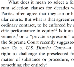
 Now consider a pair of facing pages. Notice the running headers. The typeface is small, which keeps the headers from dominating the page. And they are separated from the rest of the page by a generous gap, which keeps them from blending into the rest of the text. The headers are rich with information, too. The page numbers are in the outer corners, where it’s easy to spot them while riffling through pages. The inner corners hold the date, a good choice for a draft article. The centers identify the author and the article. This layout is conventional, and for good reason: it supplies everything the reader needs in one convenient place.2
I referred this as a pair of “facing” pages. In a printed law review, they would appear together. This draft is obviously not yet in printed form. But the arrangement still makes sense. PDF readers can display these pages together as a pair, which is a convenient way to read them you have the screen space. Indeed, you can read them side-by-side in full-screen mode, free from distractions.
 The typeface is ITC Galliard, an absolutely lovely choice. The design is by the incomprable Matthew Carter, a MacArthur Fellow and one of the world’s leading type designers. It’s based on 16th-century fonts by the French printer Robert Granjon that have the same timeless modernity as Garamonds. Carter’s revival has a lovely geometric quality, with some unexpectedly sharp corners and chiseled serifs. (This is most obvious in the question mark, and notice also the capital ‘B’ and the capital ‘C’.) But it also has a liveliness, particularly in the italic. (The lower-case ‘i’ is especially ebullient.)
The use of Galliard gives the paper a classical heft: the reader intuitively senses that each word has been chosen with care. And while it it is certainly comfortably within the mainstream of the scholarly typographic tradition, Galliard is still an uncommon choice for legal writing. That means that Steve Sachs’s papers don’t look quite like anyone else’s. They’re distinctive in a good way. What is right for him is not right for everyone. But there is a good choice for everyone, and that choice is not Times.
 The font size for body text is 11.5 points. There is no magic number for the ‘right’ point size that works in all settings. The right size varies based on the page design and the font in question. 11.5 points is a good choice here given the other choices. It yields reasonably short lines but each page still packs in a reasonable amount of text. More importantly, it looks good, something that can be judged only by fiddling with point sizes until everything clicks. The line spacing is as important as the point size. This draft uses Word’s “exactly” feature (under Paragraph Settings) to specify that every line should be 14.5 points apart. This is about half a point more generous than Word’s “single” spacing, which is usually too tight. Like font size, line spacing has to be eyeballed until it looks right.
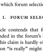
The part heading is set in all small caps, which makes it smaller than a typical line of text. But it’s also in bold, which adds heft. Extra space above (a full line of 14.5 points) and below (another 14.5 points) complete the look. Small caps are conventional for law-review parts, but all small caps and bold are different enough to be distinctive.
Not pictured: the section headers and subsection headers are indented and in italics, which visually makes clear their subordinate status. But they also have the same extra space before and after, which helps them pop from the surrounding text. Beyond that, any organizational signposts are run in with the text of of the paragraph that follows. Three levels of standalone headings are enough – or should be enough – for a well-structured law-review article.
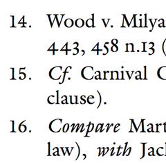 The footnotes also display great care. They’re set in 9-point type with 11.25-point line spacing and an extra two points of whitespace between footnotes, which is just enough to help the eye distinguish one from the next.
More subtly, the footnotes align vertically using a hanging indent. That indent (.25″) is exactly the same as the paragraph indent in the body text, so that everything lines up cleanly. The footnote numbers are in regular type, rather than superscripts, and they sit on the left margin, with a period and a tab separating them from the footnote text. (This is above-and-beyond attention to detail: Word can’t automatically format footnote numbers this way, so they have to be manually tweaked with a search-and-replace.)
Look also at the numerals. The ‘0’, ‘1’, and ‘2’ are the same height as lower-case letters (they are at the “x-height”); the ‘3’, ‘4’, ‘5’, ‘7’, and ‘9’ extend downward (they have “descenders”); and the ‘6’ and ‘8’ extend upwards (they have “ascenders”). These are “old-style figures,” and they suit typefaces with strong traditional roots like Galliard. (Numerals that are all the same height are called “lining figures” instead.) Their use in legal texts can be a matter of personal preference: some people think they make citations harder to read, while others find them elegant. Here, they’re consistent with the other design choices, which means they’re the right choice.
Almost all of these design decisions are within easy reach for law professors. The only one that costs money is the use of Galliard; the only one requiring technical skill is the non-superscripted footnote numbers. These are not arcane typographic secrets: if you buy and read Matthew Butterick’s Typography for Lawyers, Robert Bringhurst’s Elements of Typographic Style, or James Felici’s Complete Manual of Typography, you will learn everything you need to know to set an equally attractive page. (Add Stephen Coles’s Anatomy of Type if you want to understand what you’re seeing when you look at a font and learn to pick a good one.)
Your drafts can look this good. Let me amend that. Your drafts should look this good. What are you waiting for?
Fifth in an occasional series on typography and legal academic writing.
UPDATE (August 8, 2015): The final published version of the article uses the journal’s house style, not Steve’s. Fortunately, he has cached a copy of the version I discuss in this post. I’ve updated the link at the top accordingly.
I recommend using Adobe Reader for this. Select “Multiple” under “Paper Sizing and Handling” in the Print dialog box. Other PDF readers aren’t as good about 2-up printing and insert too much extra white space. ↩︎
In a published article, the headers would ideally contain all the information a reader needs to produce a complete citation. The journal title would replace the author’s name, and the inner corners would contain the volume number, the starting page number, and the year. ↩︎