¶ The Laboratorium (3d ser.)
A blog by James Grimmelmann
Soyez réglé dans votre vie
et ordinaire comme un bourgeois
afin d'être violent et original dans vos oeuvres.
Posts about typography
A Master Class in Law-Review Typography, Courtesy of Steve Sachs
Steve Sachs has just uploaded a new paper, The Forum-Selection Defense, to SSRN. Others can weigh in on his argument that “forum selection is a type of waiver, and a defense.” (It strikes me as right, but I know that I’m out of my depth in this corner of civil procedure.) I’d like to talk instead about something else on display in Steve’s work: superlative typography. His draft is a visual guide to best practices in law-review-article design.
Disclaimer: Steve is a friend. We have known each other since law school and we have corresponded about typography. He graciously answered several questions about his template as I was drafting this post.
This is an interactive demonstration. Click the images for larger versions.
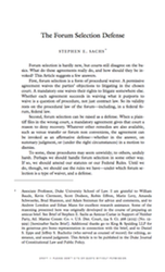
First, and most blatantly, this isn’t a standard 8.5″ × 11″ page. Instead, it’s 5.24″ × 8.63″. This is small, smaller even than a typical law-review page. But it works. The print is a reasonable size for reading: 11.5-point body text and 9-point footnotes. Thin pages mean narrow text blocks, so even the footnotes have comfortably short lines. The margins are small, too: less than half an inch. Small pages with small margins are ideal for reading on a computer screen, which is how most of us will experience the draft. With small margins, your PDF reader doesn’t sprawl out across your screen, even when you have a whole page open at once.
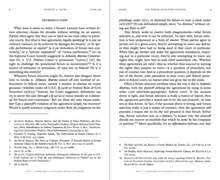
Another benefit of small pages is that you can print out the article 2-up, so that two article pages fit on each page of 8.5″ × 11″ paper. That doesn’t work well with a draft distributed using an 8.5″ × 11″ page size with wide margins: you get a 2-up page with tiny fonts and huge swathes of whitespace. But smaller pages with small margins still look great when printed 2-up.1
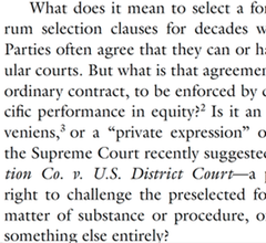
 Now consider a pair of facing pages. Notice the running headers. The typeface is small, which keeps the headers from dominating the page. And they are separated from the rest of the page by a generous gap, which keeps them from blending into the rest of the text. The headers are rich with information, too. The page numbers are in the outer corners, where it’s easy to spot them while riffling through pages. The inner corners hold the date, a good choice for a draft article. The centers identify the author and the article. This layout is conventional, and for good reason: it supplies everything the reader needs in one convenient place.2
I referred this as a pair of “facing” pages. In a printed law review, they would appear together. This draft is obviously not yet in printed form. But the arrangement still makes sense. PDF readers can display these pages together as a pair, which is a convenient way to read them you have the screen space. Indeed, you can read them side-by-side in full-screen mode, free from distractions.
 The typeface is ITC Galliard, an absolutely lovely choice. The design is by the incomprable Matthew Carter, a MacArthur Fellow and one of the world’s leading type designers. It’s based on 16th-century fonts by the French printer Robert Granjon that have the same timeless modernity as Garamonds. Carter’s revival has a lovely geometric quality, with some unexpectedly sharp corners and chiseled serifs. (This is most obvious in the question mark, and notice also the capital ‘B’ and the capital ‘C’.) But it also has a liveliness, particularly in the italic. (The lower-case ‘i’ is especially ebullient.)
The use of Galliard gives the paper a classical heft: the reader intuitively senses that each word has been chosen with care. And while it it is certainly comfortably within the mainstream of the scholarly typographic tradition, Galliard is still an uncommon choice for legal writing. That means that Steve Sachs’s papers don’t look quite like anyone else’s. They’re distinctive in a good way. What is right for him is not right for everyone. But there is a good choice for everyone, and that choice is not Times.
 The font size for body text is 11.5 points. There is no magic number for the ‘right’ point size that works in all settings. The right size varies based on the page design and the font in question. 11.5 points is a good choice here given the other choices. It yields reasonably short lines but each page still packs in a reasonable amount of text. More importantly, it looks good, something that can be judged only by fiddling with point sizes until everything clicks. The line spacing is as important as the point size. This draft uses Word’s “exactly” feature (under Paragraph Settings) to specify that every line should be 14.5 points apart. This is about half a point more generous than Word’s “single” spacing, which is usually too tight. Like font size, line spacing has to be eyeballed until it looks right.
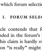
The part heading is set in all small caps, which makes it smaller than a typical line of text. But it’s also in bold, which adds heft. Extra space above (a full line of 14.5 points) and below (another 14.5 points) complete the look. Small caps are conventional for law-review parts, but all small caps and bold are different enough to be distinctive.
Not pictured: the section headers and subsection headers are indented and in italics, which visually makes clear their subordinate status. But they also have the same extra space before and after, which helps them pop from the surrounding text. Beyond that, any organizational signposts are run in with the text of of the paragraph that follows. Three levels of standalone headings are enough – or should be enough – for a well-structured law-review article.
 The footnotes also display great care. They’re set in 9-point type with 11.25-point line spacing and an extra two points of whitespace between footnotes, which is just enough to help the eye distinguish one from the next.
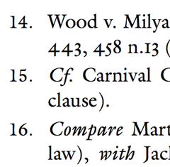
More subtly, the footnotes align vertically using a hanging indent. That indent (.25″) is exactly the same as the paragraph indent in the body text, so that everything lines up cleanly. The footnote numbers are in regular type, rather than superscripts, and they sit on the left margin, with a period and a tab separating them from the footnote text. (This is above-and-beyond attention to detail: Word can’t automatically format footnote numbers this way, so they have to be manually tweaked with a search-and-replace.)
Look also at the numerals. The ‘0’, ‘1’, and ‘2’ are the same height as lower-case letters (they are at the “x-height”); the ‘3’, ‘4’, ‘5’, ‘7’, and ‘9’ extend downward (they have “descenders”); and the ‘6’ and ‘8’ extend upwards (they have “ascenders”). These are “old-style figures,” and they suit typefaces with strong traditional roots like Galliard. (Numerals that are all the same height are called “lining figures” instead.) Their use in legal texts can be a matter of personal preference: some people think they make citations harder to read, while others find them elegant. Here, they’re consistent with the other design choices, which means they’re the right choice.
Almost all of these design decisions are within easy reach for law professors. The only one that costs money is the use of Galliard; the only one requiring technical skill is the non-superscripted footnote numbers. These are not arcane typographic secrets: if you buy and read Matthew Butterick’s Typography for Lawyers, Robert Bringhurst’s Elements of Typographic Style, or James Felici’s Complete Manual of Typography, you will learn everything you need to know to set an equally attractive page. (Add Stephen Coles’s Anatomy of Type if you want to understand what you’re seeing when you look at a font and learn to pick a good one.)
Your drafts can look this good. Let me amend that. Your drafts should look this good. What are you waiting for?
Fifth in an occasional series on typography and legal academic writing.
UPDATE (August 8, 2015): The final published version of the article uses the journal’s house style, not Steve’s. Fortunately, he has cached a copy of the version I discuss in this post. I’ve updated the link at the top accordingly.
I recommend using Adobe Reader for this. Select “Multiple” under “Paper Sizing and Handling” in the Print dialog box. Other PDF readers aren’t as good about 2-up printing and insert too much extra white space. ↩︎
In a published article, the headers would ideally contain all the information a reader needs to produce a complete citation. The journal title would replace the author’s name, and the inner corners would contain the volume number, the starting page number, and the year. ↩︎
Uncle Sam Wants YOU (To Use Good Fonts)
Switching away from Times New Roman is like showering, shaving, and putting on a clean shirt. You instantly look better, and you feel better too. With fonts as with shirts, picking a look that works for you can be an intimidating choice, but it’s worth the effort. Here are a few of my thoughts on finding a good one. I’m going to focus on serif typefaces suitable for extended legal academic writing, since that’s the main design problem I’ve thought about, although that won’t stop me from mentioning a few other typefaces I’ve found useful. I’ll proceed in rough order of difficulty: from fonts you already have, to fonts you can easily get, to fonts you need to research before buying.
System Fonts
Operating systems and office suites come with some decent fonts. All of these have issues, but they’re still miles ahead of the defaults.
- Palatino, Palatino Linotype, and Book Antiqua are basically the same typeface. It’s classical and generally unobtrusive.
- Hoefler Text is a little too ebullient for my tastes, but it’s undeniably pretty and readable.
- On the other hand, Cambria is bland bland bland, but again undeniably readable. It’s a much better default choice on Microsoft’s part.
- “Garamond” isn’t really one. It’s based on the typefaces of Jean Jannon, who lived a century after Claude Garamond. Be warned that Jannon’s italic capitals have horribly inconsistent slopes. I mention this because of the law-review convention of putting the title of the article at the top of each page in all-caps italics: “A”s and “R”s in particular just look wrong.
- Baskerville Old Style is junk, but the Baskerville that comes with Macs is perfectly usable. (It was my go-to typeface for years.)
- Bell at its best looks like it came from a 19th-century book. At its worst, it looks like it came from a 19th-century advertising flyer.
- Century Schoolbook is familiar from textbooks and Supreme Court opinions. If you use it, try to bump down the point size a bit, as it runs large.
- Goudy Old Style has much to love about it, but be careful about setting extended passages in italics. Its flourishes can look a little dated.
- Calisto is Times if it sucked in its gut and stood up straight. Better than nothing.
Free
It used to be that most free fonts were awful. But we’re in something of a free font renaissance; there are some excellent ones out there.
- Bitstream Charter was designed in 1987 as a font for displays that by today’s standards were absurdly crude and low-resolution. But it has held up well and was donated for free public use in 1992.
- Cardo was created with the needs of classicists in mind, so it contains an absurdly large selection of diacritics for ancient languages. But it’s free and it’s elegant, so why not use it for modern purposes? My homepage, for example, is set in Cardo.
- Goudy Bookletter 1911, Linden Hill, and Sorts Mill Goudy are free digital implementations of three ineffably American typefaces by Frederic Goudy (Kennerley, Deepdene, and Goudy Oldstyle, respectively). Of the three, Sorts Mill Goudy is the easiest to make work.
- Minion isn’t quite free. But you get it automatically if you install Adobe’s free-to-download Acrobat Reader, which means it’s dead simple to get. It is outstandingly nondescript; I use it when I want an authoritative typeface that avoids calling attention to itself.
- Open Sans is a fine workhorse sans serif: readable, friendly, and well executed.
- Adobe Source Code is, quite simply, the best monospaced coding typeface I have ever seen. If you need to show computer code, or want a beautiful fixed-width font, this is the one.
Adobe Font Folio
For students and faculty, the awkwardly named Adobe Font Folio 11 Education Essentials Student and Teacher Edition is an unbeatable deal. For $149, you get 25 different typefaces including more than than 500 individual fonts. In particular, it contains typefaces that are outstanding drop-in replacements for more familiar ones:
- Arno is a modern design based on Italian Renaissance principles: like Palatino but less overused.
- Garamond Premier is like the “Garamond” that comes with Office, but better.
- ITC New Baskerville is darker and more consistent than the versions that come with Macs and with Office. Utopia is a modern design with similar features.
- Try using Adobe Caslon for memos instead of Times. They’ll instantly look better, but without looking like they’re trying to hard to look better.
- If you’re ever tempted by Arial, take a deep breath and switch to Univers. It also works in place of Helvetica: same rationalist midcentury Swiss aesthetic, with a touch more personality.
All of these substitutions work effortlessly. Other typefaces in the AFF11EESTE require a little more work, but can be used to excellent effect. I have only good things to say about Avenir, Chaparral, Adobe Jenson, and Myriad.
À la Carte
If the above aren’t sufficient for your typesetting needs, you may need to seek professional help–that is, professional typefaces. Here are some that I’ve either used successfully, and some that daydream about. (I try to avoid buying fonts unless I have a specific project I need them for. I don’t always succeed.)
- Equity was designed specifically for legal writing. To see it used well, check out the specimen or Joe Miller’s free patent law casebook. Whoops. Joe’s casebook used to use Equity, but now it uses Galliard.
- My Internet Law casebook is set in Miller Text, which is essentially Georgia with all of the interesting and subtle details put back in. I’m serious: Matthew Carter designed Georgia for screens in 1993 and Miller for print in 1997. But digital displays have come far enough in the last two decades that all the lovely little details now work on screen as well.
- I love Adobe Caslon, and it has an utterly impeccable pedigree (you may recognize it from the pages of New Yorker). But the definitive modern Caslon is probably Williams Caslon. Its designer, William Berkson, geeks out in glorious detail about crafting it here and here.
- Similarly, the definitive modern Baskerville is probably František Štorm’s Baskerville Original. Here’s a specimen, albeit one that plays up the archaism. (Mrs. Eaves is a much looser version of the Baskerville model: not so suited for extended writing but astonishingly elegant and instantly recognizable.)
- UCLA’s Samuel Bray uses Dante for his drafts. (See, e.g.) Duke’s Stephen Sachs uses ITC Galliard for his. (See, e.g.) Both are versatile, elegant text faces that perfectly suit the kinds of papers they write.
- I’ve been using Bembo Book for my recent drafts. (See, e.g.) It can be tricky to get the sizing and spacing right. But when it works, it works; I think it makes for a calm, graceful, and authoritative page.
- Quirkier but distinctive faces I’ve noticed include Stickley and the legendary “lost” Doves Type.
Notes on Buying Fonts
If you are going to use a typeface for legal academic writing, you need two styles: a roman and a matching italic. That’s all. A bold and bold italic can be nice for contrast (in headings, perhaps), but you can get by perfectly well with just a roman and an italic. If you’re particularly obsessive and want to do small caps the right way, you should also get a matching small-caps style (not available for all fonts). Then, whenever you need small caps, rather than relying on your word processor’s broken small-caps command, just switch to the small-caps font.
I have had good experiences buying from MyFonts (good, wide selection) and The Font Bureau. Once you download a font, installing it is simple. Find the file and double-click to open. On both Macs and PCs, this will open up a font-manager dialog box; click the button to install. You may need to restart open applications to pick up the new fonts.
Fourth in an occasional series on typography and legal academic writing.
All the Print That Fits
I have criticized law reviews for their poor typefaces and for their poor small caps. But all is not wrong in law review-ville, because law reviews as a rule get something else right: page dimensions. 8.5″ × 11″ is a difficult size for a typeset single-column printed page, and law reviews mostly avoid its traps. The problem arises from the interaction of three constraints:
-
A line of text should be between 45 and 75 characters for optimal readability, at least according to conventional wisdom.
-
The human eye can comfortably read printed text with a font size down to about 9 or 10 points, depending on the typeface.
-
A font’s point size and its characters per inch are inversely proportional. A typical 12-point body font will have about 12 to 13 characters per inch.
In a nutshell, the problem is that an 8.5″ page is too wide. The designer needs to fill the space with something: large fonts, long lines, large margins, or multiple columns. None of these options is ideal
-
Large fonts. A single-column 8.5″ page with 1″ left and right margins has a textblock 6.5″ wide. A 14-point font will fit a comfortable 65 to 70 characters per line, But a 14-point font is big and unsubtle; a brief at 14 points stops looking like a legal document and starts looking like a Reader’s Digest Large Print legal document. It’s also profligate with paper because it fits so little text on a page–a large point size means not just fewer characters per line but also fewer lines per page. A high page count also forces readers to flip between pages more often.
-
Long lines. The obvious solution to large fonts is to bump the point size down. But the math is unforgiving. A 6.5″ line in a 10-point font will have 100 or more characters per line, far above the comfort zone. Readers will find it harder to jump from the end of one line to the start of the next without losing their place. Even a 12-point font will yield 80 characters per line, still on the high end of the comfort zone, still bumping up the page count, and often still visibly “large” to the eye.
-
Large margins. It is possible to compensate for long lines by increasing the margins rather than the font size. For example, the same 8.5″ page with 1.5″ margins will have a 5.5″ textblock. That 10-point font now yields a line closer t0 80 characters per line than 100. The page as a whole also looks better: the large margins are good for notes and give the page a more restful feel. But that empty space is still wasted on the reader who isn’t scribbling marginalia everywhere.
-
Multiple columns. At this point, the obvious typographic solution is to give up on a single column and go instead to a page with more but narrower columns and smaller margins. When magazines and scientific journals print 8.5″ × 11″, this is what they do. The resulting page is elegant, readable, and efficient. But it comes at a cost: reading on a computer is now harder. A reader without a screen large enough to show the entire page comfortably–which rules out most laptops and many tablets–will have to scroll down and then back up and to the side at each jump between columns.
Law reviews cut this Gordian knot by using smaller pages. Here are a few examples:
-
Harvard: 5.99″ × 9.02″ (1.51 : 1)
-
Michigan: 6.33″ × 9.78″ (1.55 : 1)
-
Minnesota: 6.13″ × 9.86″ (1.61 : 1)
-
Ohio State: 6.22″ × 9.82″ (1.58 : 1)
-
Penn: 5.75″ × 9.25″ (1.61 : 1)
-
Yale: 6.34″ × 9.83″ (1.55 : 1)
At these dimensions, a single-column textblock in a reasonable font size with reasonable margins easily lands within the ideal line length range. Law reviews’ fidelity to their historic page dimensions means that their page designs are often decent. This is not to say that a multi-tracked multi-page stream of text above and footnotes below is the only or best solution to the design challenge created by the content of a typical law-review article. But given that decision, law reviews generally implement it with appropriate page dimensions.
Unfortunately, the world is moving on from the printed law review: most people now read law review articles as PDFs or as printouts from PDFs. A law review that posts 8.5″ × 11″ PDFs to its website drops its carefully crafted pages in a sea of whitespace. In effect, it publishes large-margin 8.5″ × 11″ pages, but the margins are no longer designed with the textblock in mind. The reader who prefers to scroll down through a PDF now must skip several inches every time she reaches the end of a page. The reader who uses an iPad to read one page at a time must double-tap to zoom in on every page. The reader who prints out the PDF uses several dozen extra square inches of paper for each page.
Hein Online gets this one right. When you download a PDF, you get it in the size it came from the law review. Penn comes to you on a 5.75″ × 9.25″ page; Ohio State on a 6.22″ × 9.82″ page. What difference does it make, you may ask? After all, you probably don’t have 6.22″ × 9.82″ paper lying around in your office printer. But you do have another option: you can print 2-up, with two law-review pages next to each other on each physical 8.5″ × 11″ page (and thus four law-review pages per sheet of letter paper). The results aren’t perfect, but most law reviews print close enough to 5.5″ × 8.5″ (half the size of letter paper) that the pages only need to be scaled down by 10% to 15%. That’s still readable. As a result, readers who prefer to print out their PDFs have a choice of much paper to use, based on their particular needs. Readers who use digital devices have more convenient pages.
There’s a general principle here. When you have a choice, target a PDF page size that corresponds to your actual page design. You should do you best to ensure that when the resulting PDF is printed on 8.5″ × 11″, what results is still attractive and readable (just as you would ensure that when a full-color PDF is printed black-and white, what results is still attractive and readable). But by distributing a PDF that matches your physical pages, you make it easier for digital readers to experience your work as it was meant to be experienced, and you give readers who prefer to print more options.
Oh, and by the way, don’t read law review articles by downloading them from Lexis or Westlaw. Just don’t.
Third in an occasional series on typography and legal academic writing.
Small Caps, Big Problem
The second-most grievous sin of modern law-review typography is its casual disdain for proper small caps. Real small caps are created by a font designer to blend harmoniously with the rest of the letters. This is what they look like:1
 Fake small caps are created by a word processor by taking full-size capital letters and scaling them down. This is what they look like:
  The differences are apparent, and so is the reason why. As a rule, font designers are better at typography than word processors. There are at least three things wrong with fake small caps:
-
Fake small caps are too tall. Real small caps are closer to the typical height of lower-case letters, so they look better in mixed text.
-
Fake small caps are too light. Scaling down full-size letters produces thinner strokes. Real small caps have strokes that are consistent with the rest of the letters in a font. They look more solid on the page and they blend in better.
-
Fake small caps are too closely spaced. Upper-case letters resemble each other more than lower-case letters do, and they need to be spaced slightly further apart to make it easier for the eye to tell them apart.
Using real small caps is harder, but worth it. Sometimes, they come as a separate font file: in addition to Holmes Roman and Holmes Italic, you get Holmes Small Caps. Then, whenever you need to use small caps, you switch to the Small Caps font variant and there they are. This is how I typeset my casebook (sample chapter here), for example. I use Matthew Carter’s Miller and I switch between Miller Text Roman and Miller Text Roman SC as needed.
In other cases, the small-caps come packaged into the same font file as the regular letters. (This is how the OpenType font format standard works.) In theory, when you click the “small caps” command in your word processor, it switches to the right letters. In practice, your word processor ignores the real small caps in the file and makes its own ersatz small caps. For Microsoft Word, this is just par for the course. For Apple Pages, it’s especially frustrating because OS X is usually quite good about font technology. There are word processors that get this right, like Mellel, and sophisticated design programs like Indesign and Quark XPress handle real small caps, but none of these are great for a typical law review or legal scholar’s workflow.
The great irony here is that the Bluebook requires extensive use of small caps for book titles and authors and for journal names. The result is that the typical law-review page contains citations that the typical law review cannot typeset properly. Bad small caps are everywhere. Harvard and Yale have real small caps in the web versions of their articles but fake small caps in their PDFs. UCLA uses real small caps in its tables of contents but fake small caps in footnotes. Most law reviews don’t even try. It’s all the more striking to see the occasional law review that gets them right. The New York Law School Law Review, for example, uses them consistently and well in its PDFs. (Example here).
Law reviews that are looking to look better should start by choosing a better font than Times New Roman. And the very next thing they should do is use real small caps.
Second in an occasional series on typography and legal academic writing.
The typeface in the samples is Equity. Matthew Butterick designed it specifically for legal writing. He also has a charming rant against fake small caps. ↩︎
Times Out
The typical law-review article of 2015 looks a lot like the typical law-review article of 1965 or 1915: same arrangement of text and footnotes on the same size page, same general citation style, same this-that-and-the-other. But If there are differences, the article from fifty or a hundred years ago almost certainly looks better. It might feel a little musty, but it also feels inviting. You can imagine turning the pages with interest as you sit by the fireplace in a comfortable chair with a warm beverage. Its modern counterpart is bland and boring, dead on the page. Older law reviews were distinctive, too: you could tell Minnesota from Michigan from Marquette at a glance. Modern law reviews almost all look alike.
The culprit is the production process. A hundred years ago, a law review would have been mechanically typeset by a professional printer. That made the publication cycle slower and costlier, but it also meant that law reviews were designed with care. Desktop publishing democratized printing; law student with computers and Microsoft Word can produce camera-ready copy ready to send out for printing, and typically do. But since Word dominates the workflow, it it has become a kind of greatest common mediocrity in law-review design. Whatever an author submits will be hammered into the journal’s Word template and its standard predefined styles–styles that are often identical, and identically ugly, across many journals.
Typeface choice is a good example of the blandness of modern law reviews. Far and away the most common law-review typeface is the ubiquitous Times New Roman. It’s not a bad typeface, but it has become generic from massive overuse. To the modern eye, Times is the absence of design; it’s what you’re left with if you scrape every distinctive characteristic off your pages. For text intended to be unmemorable–memos from the associate dean, perhaps–Times is fine. In a law review, Times says, “Ignore me; I’m completely uninteresting. Go find something else to read.” This might be forgivable if Times were the perfect typeface for the law review page, but it isn’t. It’s a compact newspaper font, designed to save space in thin columns while preserving high legibility. Extended text–and 80-page articles are nothing if not extended–calls out for something with more grace, something easier on the eye in a lengthy reading session.
 The best way to see what a poor choice Times New Roman is for a law review is to compare it to some better ones. At the other end of the spectrum–the good end–are Harvard and Yale. The Harvard Law Review is a model of consistency: it has stuck with the obscure and quirky Old Style 7 through thick and thin. The design dates to the 1870s, and it looks like it: the numerals and the italic have a late Victorian feel. The Harvard Law Review still speaks the same visual language it did when it was founded in 1887, which adds significantly to the feeling of gravitas and tradition its articles enjoy. You half expect to turn the page and come across something by Holmes, because what you’re reading is typeset in more or less the same way that The Path of the Law was. 1
 The Yale Law Journal’s design has varied more over the years (including an unfortunate run of Times). But its most recent redesign, based on the proprietary typeface Matthew Carter created for Yale University,2 is absolutely gorgeous. Carter’s work is meticulously based on the best of Renaissance font design, and his Yale typeface is classically elegant while being eminently readable. (For an example of its distinctive grace, zoom in on a lowercase ‘h’ and observe how the right leg bends inwards.) Yale paired it with Lucas de Groot’s fine TheSans to create one of the best looking law-review pages in the business.
 Two other standouts–the UCLA Law Review and the University of Pennsylvania Law Review–use variants of Caslon, a grand old standby of the typeface world. “When in doubt, use Caslon,” was conventional wisdom among printers, with good reason. Caslon has many of Times’s good qualities but few of the bad. It’s solid, unpretentious, easy to read for hours, and just plain comfortable. UCLA uses Carol Twombly’s Adobe Caslon, while Penn uses William Berkson’s Williams Caslon, both outstanding modern revivals. It’s interesting to compare the two pages to see how much of a difference small tweaks can make: UCLA’s is modern and unobtrusive, where Penn’s is classical and reserved. Both work well.
 A few other typefaces show up with some regularity in law reviews. Century Schoolbook shows up here and there, e.g. in Minnesota and Chicago. It’s a fine choice: readable, clean, and familiar. Baskerville is another occasional choice; you see it, for example, in Iowa and Columbia. It too is a fine choice: crisp, professional, and serious. Both have excellent pedigrees in legal writing: Century Schoolbook is used for Supreme Court briefs and opinions, and Baskerville has been used for governmental publications since Ben Franklin fell in love with it.

 Also worthy of mention is Case Western’s use of Donald Knuth’s Computer Modern. There’s a meaningful connection between the face and the place: Knuth is a Case alum, though from the college rather than the law school. He’s one of the modern giants of computer science, and he created TeX, a landmark in computer typesetting. Computer Modern was his stab at a typeface to go with TeX. But Knuth is a better programmer than type designer, and Computer Modern is unattractive and hard on the eyes. But because it’s the default for TeX, it’s become the Times of technical papers. It’s not what I would have chosen, but it is distinctive, which is to say, at least it’s not Times.
 The great missed opportunity of law review font choice is that the California Law Review uses Times, rather than Berkeley Oldstyle, the typeface the great Frederic Goudy designed specifically for U.C. Berkeley. Not only is it a pleasing typeface, but its details make it as Californian as the Berkeley hills. (Look at the gentle curve on the upper arm of the lower-case ‘k’, for example.) Making the choice even more inexplicable, the university itself offers a digital version of Goudy’s design for download under the name “UC Berkeley Oldstyle.”
 There are good reasons and bad reasons to pick a typeface for a law review. Licensing is a serious concern, and so is the logistical challenge of making sure that every editor’s computer has the appropriate fonts. But widely-used software frequently comes bundled with good fonts: if you have Adobe Reader on your computer, for example, you already have Robert Slimbach’s runaway hit Minion. And there are also freely available typefaces that are much better than Times, like Matthew Carter’s Charter.

 Law review editorial boards: if you want to up your typographic game, choosing a better typeface is a good place to start. Where by “better,” I mean “anything but Times.”
First in an occasional series on typography and legal academic writing.
On its website, Harvard uses Hoefler Text, which is a decent enough match for Old Style 7, comes preinstalled on Macs, and has advanced features like ligatures, ornaments, and bold. That’s how serious Harvard is about tradition: Old Style 7 doesn’t have bold, and neither does the Harvard Law Review. ↩︎
You can’t get the fonts unless you’re a Yale affiliate, and even then you’re only allowed to use them for University purposes. But commercially available fonts that capture some of the same flavor include Bembo, Dante, and Galliard (also a Carter design). ↩︎