¶ The Laboratorium (3d ser.)
A blog by James Grimmelmann
Soyez réglé dans votre vie
et ordinaire comme un bourgeois
afin d'être violent et original dans vos oeuvres.
2015 archives
Authorship in Binaries
Personality always contains something unique. It expresses its singularity even in handwriting, and a very modest grade of art has in it something irreducible, which is one man’s alone. That something he may copyright unless there is a restriction in the words of the act.
Bleistein v. Donaldson Lithographing Co., 188 U.S. 239, 250 (1903) (Holmes, J.)
Previous work shows that coding style is quite prevalent in source code. We were surprised to find out that coding style is preserved to a great degree even in compiled source code. We can de-anonymize programmers from compiled source code with great accuracy and furthermore we can de-anonymize programmers from source code compiled with optimization.
Aylin Caliskan-Islam, Fabian Yamaguchi, Edwin Dauber, Richard Harang, Konrad Rieck, Rachel Greenstadt, and Arvind Narayanan, When Coding Style Survives Compilation: De-anonymizing Programmers from Executable Binaries, at 13.
These new results have important implications for privacy and security. But they also put a new and slightly surprising spin on debates over software copyright. If programmers have distinctive styles that are recognizable across programs and are present even in optimized executable binaries stripped of symbol information, then the argument that software lacks expressive content is a little weaker. Traces of authorial personality survive, like bacteria, even in unlikely environments.
There's No Such Thing as a Computer-Authored Work
I have a new essay draft: There’s No Such Thing as a Computer-Generated Work – And It’s a Good Thing, Too. I wrote it for the Columbia Kernochan Center’s fall symposium on Copyright Outside the Box: a day of conversations about various challenges to copyright’s ideas about authorship.
I spoke on a panel about computer-generated works, and my paper was an attempt to drive a wedge between the (real and useful) category of computer-_generated_ works and the (confusing and distracting) dream of computer-_authored_ works. There is, I think, a constant temptation to attribute authorship to computer programs as a way of avoiding hard questions about human authorship. I say temptation, because it doesn’t lead anywhere useful, and indeed once one has gone down that frustrating alley only to backtrack when it dead-ends, it’s much harder to understand the actual issues posed by authors who collaborate using computers. Here’s the abstract:
Treating computers as authors for copyright purposes is a non-solution to a non-problem. It is a non-solution because unless and until computer programs can qualify as persons in life and law, it does no practical good to call them “authors” when someone else will end up owning the copyright anyway. And it responds to a non-problem because there is nothing actually distinctive about computer-generated works.
There are five plausible ways in which computer-generated works might be considered meaningfully different from human-generated works: (1) they are embedded in digital copies, (2) people create them using computers rather than by hand, (3) programs can generate them algorithmically, (4) programmers as well as users contribute to them, and (5) programs can generate them randomly. But all of these distinctions are spurious. Old-fashioned pen-and-paper works raise all of the same issues. A close look at the creative process shows how little really changes when authors use digital tools. The problems posed for copyright by computer-generated works are not easy, but they are also not new.
As the draft states, I am eager to hear your comments. There are a few places where my discussion is underbaked; I am weighing how much more I need to say to shore up my argument against how much more I can say without getting bogged down in unnecessary detail. Any and all suggestions are welcome.
Update : Apparently, I can’t even quote myself accurately. I’ve updated the title of this post to properly reflect the title of my paper.
A Pyrrhic Loss
Two years ago, I posted about a troubling class-action settlement in Berry v. LexisNexis Risk & Information Analytics Group. The suit alleged that Lexis violated the Fair Credit Reporting Act with a product called Accurint; the settlement worried me because it gave Lexis prospective immunity from the FCRA for a new and different product called Contact and Locate. As I explained in Future Conduct and the Limits of Class-Action Settlements, such forward-looking future-conduct releases are dangerous six ways from Sunday. Just like in the (fortunately rejected) Google Books settlement, they give defendants official court approval to do things that can blatantly violate class members’ rights in new and unprecedented ways.
One year ago, I filed an amicus brief in a appeal of the case to the Fourth Circuit. Together with an outstanding team from Brown Goldstein Levy, I argued that the settlement’s blanket go-ahead for Contact and Locate went beyond what the trial court could legitimately have approved.
Today, the Fourth Circuit rejected our argument and affirmed the approval of the settlement. But I’m still happy about the result. Let me explain.
The brief’s argument, in a nutshell, was the following:
- A class-action settlement that releases claims based on the defendant’s future conduct is impermissible if that future conduct is different in kind than the past conduct the defendant is being sued for.
- Under the proposed settlement in Berry, Contact and Locate (the future product) could be a substantially different product than Accurint (the past product).
- Therefore, the settlement in Berry is impermissible.
True, the Fourth Circuit rejected our conclusion and allowed the settlement, but it did so by rejecting our minor premise (about the facts in Berry) rather than our major premise (about the law of class-action settlements). In the passage that matters most to me, Judge Harris wrote:
According to the Objectors, the upshot is that Lexis has carte blanche to develop Contact & Locate into a product that is indeed a “consumer report” under the FCRA, while class members, bound by their stipulation, will be unable to respond.
We think that significantly overstates Lexis’s freedom under the Agreement. It is true that the Agreement provides Lexis the discretion it needs to develop Contact & Locate according to market needs. But as the district court explained, it also sets boundaries for the design and implementation of Contact & Locate, which assure that the product cannot operate as a “consumer report” for purposes of the FCRA. Under the Agreement, for instance, Contact & Locate may include only information that does not contain any of the “seven characteristic” consumer information covered by the FCRA. J.A. 121; Berry, 2014 WL 4403524, at *4. And in the section of the Agreement labeled the “Rule 23(b)(2) Settlement Class Release,” J.A. 129, the parties clarify that their agreement is only that the “Post Settlement Products” (of which Contact & Locate is one) “shall not be ‘consumer reports’ within the meaning of the FCRA _so long as [they] are not used in whole or in part as a factor in determining eligibility for credit_” or any other purpose that could qualify them as consumer reports. J.A. 132-33 (emphasis added). Under that provision, Lexis has no free pass from FCRA liability; instead, the Agreement applies only so long as Contact & Locate remains true to the parties’ intent and is not used in a manner that would make it a “consumer report.”
… Contact & Locate is a new name, but it is a new name for what is essentially a scaled-down version of the old Accurint reports, without the features that allegedly made Accurint troublesome under the FCRA. In class action settlements, parties may release not only the very claims raised in their cases, but also claims arising out of the “identical factual predicate.” See, e.g., In re Literary Works in Elec. Databases Copyright Litig., 654 F.3d 242, 248 (2d Cir. 2011). Although the name of the product has changed, now, as before, Lexis attempts only to sell information that will enable debt collectors to locate assets, and not information to be used for credit eligibility determinations. Because the (b)(2) Class can release claims against Accurint, it can do so for Contact & Locate, as well.
This is not how I read the settlement agreement; I think it was written to give Lexis much more freedom of maneuver than the Fourth Circuit now says it has. But my reading, right or wrong, doesn’t matter any more; the Fourth Circuit’s construction will control, and the Fourth Circuit says that Lexis is tightly circumscribed in what it can do with Contact & Locate. So on one way of looking at things, Judge Harris and her colleagues gave the settlement a narrowing construction to eliminate a potential obstacle to it – a narrowing construction that mostly fixes the thing I was worried about in it.
On the bigger issue – the law of future-conduct releases – Judge Harris’s opinion broke no new ground, but was precisely correct in what it said. Judge Harris applied the identical factual predicate test in exactly the way I think it ought to be applied, explaining, “Contact & Locate is a new name, but it is a new name for what is essentially a scaled-down version of the old Accurint reports.” So in future cases raising similar issues, Berry will stand for the right proposition: a settlement can include releases for less extreme future conduct by the defendant, but not for more extreme future conduct.
If this is what it feels like to lose, I’ll take more losses, please.
Defrauding a Robot Circa 1887
R. v. Hands, [1887] 16 Cox C.C. 188 (Crown Cas. Res.):
Lord Coleridge, C.J. In this case a person was indicted for committing a larceny from what is known as an “automatic box,” which was so constructed that, if you put a penny into it and pushed a knob in accordance with the directions on the box, a cigarette was ejected onto a bracket and presented to the giver of the penny. Under these circumstances there is no doubt that the prisoners put in the box a piece of metal which was of no value, but which produced the same effect as the placing a penny in the box produced. A cigarette was ejected which the prisoners appropriated; and in a case of that class it appears to me there clearly was larceny. The means by which the cigarette was made to come out of the box were fraudulent, and the cigarette so made to come out was appropriated.
I never regret reading old case reports. Never.
The Rhetoric of the Right to be Forgotten
I have been thinking recently about Europe’s ongoing experiment so-called “Right to be Forgotten” (or, as Miquel Peguera calls it, the “Right to be Delisted”). Under the European Court of Justice’s opinion in the Google Spain case, search engines must remove links to information that is “inadequate, irrelevant, or no longer relevant” to a search for a person’s name. Reaction to the decision on this side of the Atlantic has generally not been kind. Here are three common types of arguments against it:
-
“Haven’t you heard of the Streisand Effect?” Trying to censor information online perversely calls attention to it. Here, Google notifies websites of right-to-be-delisted requests; as a result, news sites write stories about their old stories that have been delisted, and search engines link to those new stories.
-
“The Internet interprets censorship as damage and routes around it.” Trying to remove information from the web is futile, because it will always pop up again somewhere else. Here, that “somewhere else” includes the sites where the original information was posted and search engines’ non-European sites.
-
“Don’t break the Internet.” Deleting links jeopardizes the global openness that makes the Internet what it is, undermining innovation, community, and free expression around the world. Here, the right to be delisted threatens Internet engines, a spectacularly valuable technology.
Don’t dwell on whether these arguments are right or wrong. Instead, take a moment to note that they are identical – identical – to the three types of rhetoric Albert O. Hirschman identified as characteristic of reactionary conservatism::
According to the perversity thesis, any purposive action to improve some feature of the political, social, or economic order only serves to exacerbate the condition one wishes to remedy. The futility thesis holds that attempts at social transformation will be unavailing, that they will simply fail to “make a dent.” Finally, the jeopardy thesis argues that the cost of the proposed change or reform is too high as it endangers some previous, precious accomplishment.
Robert Burt, 1939–2015
Robert Burt, emeritus professor of law at Yale Law School, died Tuesday at the age of 76. I took his Family Law course in the fall of 2003. He was a thoughtful and kind teacher, and his course expanded my sense of families and my sense of law. I vividly remember the day we discussed aging and family support for the elderly. He told us, with a bittersweet smile on his face, that life is a tragedy. It was a message whose full truth we come to only with time and its ravages; in delivering it, he reached across the years between us and for a moment held us close.
Casebook 5.0
I’m happy to announce that the Fifth Edition of my casebook, Internet Law: Cases and Problems, is now available. This was a cleanup and consolidation year; the majority of the edits consisted of revising and tightening up sections that had become unwieldy with time. There are between thirteen and fifteen new cases, depending on how you count; at least nine older cases have left to make room. The second-most obvious changes are in the heavily rewritten sections on harmful speech and network neutrality, both of which seem to fall out of date every time I blink. There are new notes on spam, ICANN, the DMCA Section 1201 exemption process, and more. And as always, there are hundreds of smaller tweaks and refinements.
The book continues to be available through Semaphore Press as a pay-what-you-want DRM-free PDF download with a suggested price of $30. We continue to find that a substantial majority of law students choose to pay something for the book, and a substantial majority of those who pay choose to pay the suggested price. That says to me that the book’s audience considers the publishing model a fair one, something I consider important in this era of predatory textbook pricing.
I said above that the substantive revisions were the “second-most” apparent because the most evident change is that the book has received a significant redesign. We shifted our print-on-demand partner from Lulu to Amazon CreateSpace, which should mean more convenient ordering and better shipping terms. It also provided a good occasion to reconsider the book’s layout. As loyal readers of this blog know, I dislike the 8.5″ × 11″ format. The book is now a more comfortable 7″ × 10″ – a classic textbook size – with a more natural type size. I redid all of the spacing, indentation, headings, and other layout settings to match, and put Matthew Butterick’s fine sans-serif typeface Concourse to work for headings, case names, URLs, and other accents.
As always, please let me know what you think works and what doesn’t. To me, the release of one edition means it’s time to start gathering notes for the next.
The Doom That Came to Kickstarter
The Federal Trade Commission has sued and settled with Erik Chevalier over his failed Kickstarter project, The Doom That Came to Atlantic City. He raised $122,874 from 1,246 backers for this Cthulhu-themed board game, promising them rewards like copies of the game and pewter figurines. But, as detailed in the FTC’s complaint, he spent the money on his rent and buying licenses for a different gaming project. Chevalier agreed to a $111,793.71 judgment, which is suspended because he unsurprisingly doesn’t have the money to pay it.
This is an important moment for crowdfunding. This settlement provides important guidance about when a failed project goes from regrettable to actionable. The FTC didn’t allege that the game itself was a scam, a fake project Chevalier had no intention of delivering. (There are plenty of those, and there was never much of a question that out-and-out scams are illegal.) Instead, the FTC alleged only that Chevalier promised to deliver rewards to backers, and didn’t.
But if the FTC were to start suing every Kickstarter project that doesn’t deliver its backer rewards, creators would be in big trouble. Kickstarter failures are routine, and many of those failures are regrettable without being culpable. If every creator whose project failed had to give backers a full refund, Kickstarter-style crowdfunding would collapse.The people who need Kickstarter to fund their projects are precisely the people who can’t afford to promise that they will deliver or else. Stores deliver or else; Kickstarter is not a store.
That’s why the other allegations in the FTC’s complaint are so significant. As the project gradually imploded, Chevalier first lied about his progress and then went silent. He told backers the game was “in production”; it wasn’t. He said he used the money for game-related expenses; he didn’t. He promised to provide a full accounting of expenses; he still hasn’t.
You might read these lies as establishing that The Doom That Came to Atlantic City was indeed a fraud from the start. Perhaps. But note that all of these misrepresentations came after he had the money in hand. So another interpretation is that the FTC was upset about how he misspent the money and especially about the bad communication. If this is right, then Chevalier would have been fine if he had delivered the rewards, or if he had spent the money in good faith and been honest about what went wrong.
Not coincidentally, this is what Kickstarter’s new-ish terms of use now say. Creators no longer make an absolute promise to deliver rewards to backers. Instead, they “owe their backers a high standard of effort, honest communication, and a dedication to bringing the project to life.” Creators who “work diligently and in good faith to bring the project to the best possible conclusion” will be allowed to walk away even if the project fails. Those who do not are in trouble.
This strikes me as a good standard. The ethical expectations of the situation are that creators will do their best – no more, and no less. Kickstarter’s terms of use get this. And I think the FTC does, too.
Do You Consent?
I have a short piece at Slate, Do You Consent?, on ethical oversight of Internet companies’ experiments on users. My focus is on the two-cultures problem: academics and technologists have very different values, and experiments like Facebook’s blend them in ways that can undercut academic ethics. Here’s an excerpt:
Why the heat? In part it’s because when Facebook’s “data scientists” do empirical studies on users and publish the results in peer-reviewed journals, they’re acting like academics. Facebook, though, is a company, and its values are not the values of the academy. It’s hard to think of a slogan more antithetical to the careful and deliberative attitude of scholars toward their craft than “move fast and break things.” What is common sense in industry is crazy talk in the ivory tower, and vice versa. This isn’t just a case of disruptive innovation disruptively disruptifying everything in its path and leaving no survivors in its wake. It’s a case of two very different ethical worlds colliding.
Copyright for Literate Robots
I’ve just posted my most recent essay draft, Copyright for Literate Robots. It started out as a talk on library copying, but as I dug into the research, it turned into something … else. I realized that a simple bright-line rule explains a lot of recent fair use caselaw: copying doesn’t count when it’s done by robots. Any uses that will never be seen by human eyes are categorically non-infringing. The cases don’t say this is the rule, but it is.
Once I put it like that, I wondered how far I could follow the thread. Quite a ways, it turned out. The resulting essay looks back, to technologies like the player piano, and forward, to our increasingly automated future. Copyright’s sometimes-skeptical and sometimes-tolerant attitude toward new technologies appears in a different light when we think about its traditional attitude toward human authorship and about a future dominated by robotic reading.
Here’s the abstract:
Almost by accident, copyright has concluded that copyright law is for humans only: reading performed by computers doesn’t count as infringement. Conceptually, this makes sense: copyright’s ideal of romantic readership involves humans writing for other humans. But in an age when more and more manipulation of copyrighted works is carried out by automated processes, this split between human reading (infringement) and robotic reading (exempt) has odd consequences and creates its own tendencies toward a copyright system in which humans occupy a surprisingly peripheral place. This essay describes the shifts in fair use law that brought us here and reflects on the role of robots in copyright’s cosmology.
Now in Print: Anarchy, Status Updates and Utopia
I have just received the final PDF version of my symposium essay in the pace Law Review on the impossibility of online anarchy, Anarchy, Status Updates, and Utopia. If you have already seen the version I posted in 2013’s Speed Scholarship Week, there is no need to read this one; the substance is mostly the same. But if the last time you saw this piece was at the 2011 Governance of Social Media Workshop at Georgetown, or at the 2007 TIP Group conference at the University of Toronto, please check out the new one. Four and eight years, respectively, have helped me really hone the argument. Here is the introduction:
Social software has a power problem. Actually, it has two. The first is technical. Unlike the rule of law, the rule of software is simple and brutal: whoever controls the software makes the rules. And if power corrupts, then automatic power corrupts automatically. Facebook can drop you down the memory hole; PayPal can garnish your pay. These sovereigns of software have absolute and dictatorial control over their domains.
Is it possible to create online spaces without technical power? It is not, because of social software’s second power problem. Behind technical power, there is also social power. Whenever people come together through software, they must agree which software they will use. That agreement vests technical power in whoever controls the software. Social software cannot be completely free of coercion – not without ceasing to be social, or ceasing to be software.
Rule-of-law values are worth defending in the age of software empires, but they cannot be fully embedded in software itself. Any technical design can always be changed through an exercise of social power. Software can help by making this coercion more obvious, or by requiring more people to join together in it, but software alone cannot fully protect users. Whatever limits make social software humane, free, and fair will have to come from somewhere else – they will have to come from We the Users.
Grimmelmann on Willis on Consumer Law
I have a new Jotwell review, An Offer You Can’t Understand, discussing Lauren Willis’s illuminating new article, Performance-Based Consumer Law. My introduction:
Two decades ago, contract law ran headlong into online terms of service, looked around briefly in confusion, and announced that it needed to go take a nap. It has not been heard from since. In its place we have something that looks like contract law, and claims to be contract law, but is oddly ignorant of things that the real contract law would know. This usurper, part Martin Guerre and part pod person, is formalistic to a fault, obsessed with meaningless details, lazy beyond belief, and utterly devoid of human feeling.
Generations of scholars have tried to unmask this impostor, to little effect. Lauren Willis’s Performance-Based Consumer Law offers a different and more promising way of protecting consumers from overreaching and incomprehensible terms of service. Consumer law cares about form contracts, too, but it can afford to be more realistic about how well consumers actually understand them – or don’t.
The Law and Ethics of Experiments on Social Media Users
I have a new paper out in the Colorado Technology Law Journal, The Law and Ethics of Experiments on Social Media Users. It’s the scholarly version of my work from last summer on the Facebook and OkCupid experiments. The basic argument should be familiar: running scientific experiments on users without their consent or institutional oversight raises serious ethical and legal concerns. But, thanks to the CTLJ and Paul Ohm’s December conference at the University of Colorado, When Companies Study Their Customers, I have taken the opportunity to revise and extend my remarks. It’s long for a symposium essay – 23,000 words – and I hope that it can also serve as a reference on last summer’s controversy.
Here’s the abstract:
If you were on Facebook in January 2012, there is a chance that it tried to make you sad. If you were on OkCupid, there is a chance that it tried to match you up with someone incompatible. These were social psychology experiments: Facebook and OkCupid systematically manipulated people’s environments to test their reactions. Academics doing similar experiments in a university setting would typically need to obtain informed consent from participants and approval from an Institutional Review Board (IRB). But Facebook and OkCupid, and the academics working with Facebook, had neither. This, I believe, is a problem.
These experiments offer us a moment for reflection, a chance to discuss the law and ethics of experiments on social media users. In this essay, I will consider social media research through the prism of the Facebook and OkCupid experiments. I will focus on three questions: (1) When do social media experiments constitute research involving people? (2) What does it take to obtain the informed consent of users? (3) What institutions are responsible for reviewing such experiments?
Part I offers an initial review of the Facebook and OkCupid research projects. Part II – the bulk of the essay – takes up these questions under current law. Part III considers the broader question of what the rules for regulating social media research ought to be. The most immediately pressing priority is to prevent the unraveling of the existing ethical framework through IRB laundering, in which a regulated institution outsources enough work to an unregulated one to evade IRB review and informed consent. Looking further ahead, I offer some tentative thoughts on the scope of coverage, informed consent, and oversight for social media experiments. Finally, the conclusion reflects on how we should think about consent in this setting.
A prudent creditor … cannot, and will not try to, protect himself against all the risks to which he subjected himself by making the loan; he accepts as invetable what may be called the business risks inherent in the situation – the risk that the barber shop will go broke as young men suddently decide to let their hair grow long, like their ancestors, or the risk that the bottom will fall out of the real estate market as people conclude that it is more pleasant to live in the sea, like their ancestors.
A prudent creditor … cannot, and will not try to, protect himself against all the risks to which he subjected himself by making the loan; he accepts as invetable what may be called the business risks inherent in the situation – the risk that the barber shop will go broke as young men suddently decide to let their hair grow long, like their ancestors, or the risk that the bottom will fall out of the real estate market as people conclude that it is more pleasant to live in the sea, like their ancestors.
—Bayless Manning & James J. Hanks, Jr., Legal Capital 9–10 (3d ed. 1990)
Riskstarter
This weekend’s New York Times Magazine story about the failure of the ZPM espresso maker Kickstarter reminds me to say: Kickstarter is a tool for managing risk.
Kickstarter specializes in creative projects, but creative projects are inherently risky. They are risky in an artistic sense: creativity is an uncertain and unpredictable process. They are risky in a transactional sense: you never know how good a book is going to be until you’ve read it. And they are risky in a financial sense: they take investments that may never be recouped by anyone.
Sure things don’t need crowdfunding. If you run a sandwich shop and you need money to buy more bread and cold cuts, you can borrow it, because the bank can be confident that you can turn the ingredients into sandwiches and sell those sandwiches to customers. It’s the significant danger that an entire project will tank that makes this model unappealing for creative projects. If the game isn’t fun, or the watch doesn’t work, or the footage is unusable, either the creator or the bank will be out a lot of money.
The Kickstarter model shifts some of this creative risk onto backers. By fronting the money, they climb in the boat with the creator. Ideally, they make a rational calculation about how much they’re willing to lose if sinks. (Kickstarter’s required disclosures are supposed to help backers make this decision.) And ideally also, the unique personal appeal of the project gives them a good reason to take on that risk. (Kickstarter’s required video and other personalizing touches are supposed to help create this solidarity.)
But this means that failed Kickstarters are normal accidents. It’s built into the model. Even successes are late three-quarters of the time. This doesn’t mean that any given project that fails does so for good reasons. There are scammers on Kickstarter, and flakes, and bad-luck cases, and well-intentioned creators who get in way over their heads. Kickstarter’s rules try to reduce these unforced errors. But they can’t completely eliminate failures, not without eliminating the very elements of the unknown that make creative projects compelling. If Kickstarters never failed, it would mean that creators weren’t being ambitious enough.
A Master Class in Law-Review Typography, Courtesy of Steve Sachs
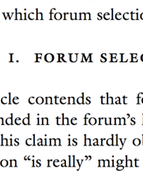
Steve Sachs has just uploaded a new paper, The Forum-Selection Defense, to SSRN. Others can weigh in on his argument that “forum selection is a type of waiver, and a defense.” (It strikes me as right, but I know that I’m out of my depth in this corner of civil procedure.) I’d like to talk instead about something else on display in Steve’s work: superlative typography. His draft is a visual guide to best practices in law-review-article design.
Disclaimer: Steve is a friend. We have known each other since law school and we have corresponded about typography. He graciously answered several questions about his template as I was drafting this post.
This is an interactive demonstration. Click the images for larger versions.
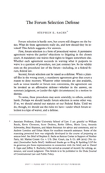
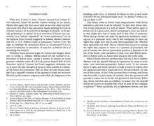
First, and most blatantly, this isn’t a standard 8.5″ × 11″ page. Instead, it’s 5.24″ × 8.63″. This is small, smaller even than a typical law-review page. But it works. The print is a reasonable size for reading: 11.5-point body text and 9-point footnotes. Thin pages mean narrow text blocks, so even the footnotes have comfortably short lines. The margins are small, too: less than half an inch. Small pages with small margins are ideal for reading on a computer screen, which is how most of us will experience the draft. With small margins, your PDF reader doesn’t sprawl out across your screen, even when you have a whole page open at once.
Another benefit of small pages is that you can print out the article 2-up, so that two article pages fit on each page of 8.5″ × 11″ paper. That doesn’t work well with a draft distributed using an 8.5″ × 11″ page size with wide margins: you get a 2-up page with tiny fonts and huge swathes of whitespace. But smaller pages with small margins still look great when printed 2-up.1
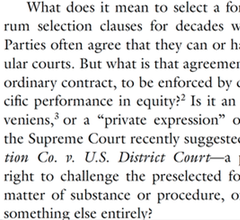
 Now consider a pair of facing pages. Notice the running headers. The typeface is small, which keeps the headers from dominating the page. And they are separated from the rest of the page by a generous gap, which keeps them from blending into the rest of the text. The headers are rich with information, too. The page numbers are in the outer corners, where it’s easy to spot them while riffling through pages. The inner corners hold the date, a good choice for a draft article. The centers identify the author and the article. This layout is conventional, and for good reason: it supplies everything the reader needs in one convenient place.2
I referred this as a pair of “facing” pages. In a printed law review, they would appear together. This draft is obviously not yet in printed form. But the arrangement still makes sense. PDF readers can display these pages together as a pair, which is a convenient way to read them you have the screen space. Indeed, you can read them side-by-side in full-screen mode, free from distractions.
 The typeface is ITC Galliard, an absolutely lovely choice. The design is by the incomprable Matthew Carter, a MacArthur Fellow and one of the world’s leading type designers. It’s based on 16th-century fonts by the French printer Robert Granjon that have the same timeless modernity as Garamonds. Carter’s revival has a lovely geometric quality, with some unexpectedly sharp corners and chiseled serifs. (This is most obvious in the question mark, and notice also the capital ‘B’ and the capital ‘C’.) But it also has a liveliness, particularly in the italic. (The lower-case ‘i’ is especially ebullient.)
The use of Galliard gives the paper a classical heft: the reader intuitively senses that each word has been chosen with care. And while it it is certainly comfortably within the mainstream of the scholarly typographic tradition, Galliard is still an uncommon choice for legal writing. That means that Steve Sachs’s papers don’t look quite like anyone else’s. They’re distinctive in a good way. What is right for him is not right for everyone. But there is a good choice for everyone, and that choice is not Times.
 The font size for body text is 11.5 points. There is no magic number for the ‘right’ point size that works in all settings. The right size varies based on the page design and the font in question. 11.5 points is a good choice here given the other choices. It yields reasonably short lines but each page still packs in a reasonable amount of text. More importantly, it looks good, something that can be judged only by fiddling with point sizes until everything clicks. The line spacing is as important as the point size. This draft uses Word’s “exactly” feature (under Paragraph Settings) to specify that every line should be 14.5 points apart. This is about half a point more generous than Word’s “single” spacing, which is usually too tight. Like font size, line spacing has to be eyeballed until it looks right.
The part heading is set in all small caps, which makes it smaller than a typical line of text. But it’s also in bold, which adds heft. Extra space above (a full line of 14.5 points) and below (another 14.5 points) complete the look. Small caps are conventional for law-review parts, but all small caps and bold are different enough to be distinctive.
Not pictured: the section headers and subsection headers are indented and in italics, which visually makes clear their subordinate status. But they also have the same extra space before and after, which helps them pop from the surrounding text. Beyond that, any organizational signposts are run in with the text of of the paragraph that follows. Three levels of standalone headings are enough – or should be enough – for a well-structured law-review article.
 The footnotes also display great care. They’re set in 9-point type with 11.25-point line spacing and an extra two points of whitespace between footnotes, which is just enough to help the eye distinguish one from the next.
More subtly, the footnotes align vertically using a hanging indent. That indent (.25″) is exactly the same as the paragraph indent in the body text, so that everything lines up cleanly. The footnote numbers are in regular type, rather than superscripts, and they sit on the left margin, with a period and a tab separating them from the footnote text. (This is above-and-beyond attention to detail: Word can’t automatically format footnote numbers this way, so they have to be manually tweaked with a search-and-replace.)
Look also at the numerals. The ‘0’, ‘1’, and ‘2’ are the same height as lower-case letters (they are at the “x-height”); the ‘3’, ‘4’, ‘5’, ‘7’, and ‘9’ extend downward (they have “descenders”); and the ‘6’ and ‘8’ extend upwards (they have “ascenders”). These are “old-style figures,” and they suit typefaces with strong traditional roots like Galliard. (Numerals that are all the same height are called “lining figures” instead.) Their use in legal texts can be a matter of personal preference: some people think they make citations harder to read, while others find them elegant. Here, they’re consistent with the other design choices, which means they’re the right choice.
Almost all of these design decisions are within easy reach for law professors. The only one that costs money is the use of Galliard; the only one requiring technical skill is the non-superscripted footnote numbers. These are not arcane typographic secrets: if you buy and read Matthew Butterick’s Typography for Lawyers, Robert Bringhurst’s Elements of Typographic Style, or James Felici’s Complete Manual of Typography, you will learn everything you need to know to set an equally attractive page. (Add Stephen Coles’s Anatomy of Type if you want to understand what you’re seeing when you look at a font and learn to pick a good one.)
Your drafts can look this good. Let me amend that. Your drafts should look this good. What are you waiting for?
Fifth in an occasional series on typography and legal academic writing.
UPDATE (August 8, 2015): The final published version of the article uses the journal’s house style, not Steve’s. Fortunately, he has cached a copy of the version I discuss in this post. I’ve updated the link at the top accordingly.
I recommend using Adobe Reader for this. Select “Multiple” under “Paper Sizing and Handling” in the Print dialog box. Other PDF readers aren’t as good about 2-up printing and insert too much extra white space. ↩︎
In a published article, the headers would ideally contain all the information a reader needs to produce a complete citation. The journal title would replace the author’s name, and the inner corners would contain the volume number, the starting page number, and the year. ↩︎
In Memoriam Greg Lastowka

Greg Lastowka died last night, much too young, after a long and difficult struggle with a rare and aggressive throat cancer. Greg was a law professor at Rutgers-Camden, the world’s leading legal academic authority on virtual worlds and online games, and a friend. He will be missed.
I discovered Greg’s work the way a great many people did: through his groundbreaking 2004 article with Dan Hunter, The Laws of the Virtual Worlds. It gave the first in-depth treatment of virtual worlds in the legal literature, and it posed fundamental questions about how property and governance ought to work online. When it hit SSRN, I had just competed a long and sprawling paper on law in virtual worlds, and my first reaction – after the sinking sense of being preempted – was to wonder just who it was who had beaten me to the punch.
The answer, it turned out, was a modest, generous, and thoughtful young law professor who was more interested in being part of a thriving academic community than in building a superstar’s reputation for himself. Greg, I came to learn, was a loving husband and father, a former Peace Corps volunteer who had served in Turkmenistan, and a dedicated public servant who took on the most unbelievably thankless tasks that university administrations can slough off onto their faculty. He was a booster of good scholarship wherever it could be found, a low-key and patient institution-builder, and a calming presence in contentious debates. Greg was a mensch.
He was a generation ahead of me in the academy, and he was one of my favorite people to see at conferences. We wrote on overlapping topics and he was helpful and encouraging to me on many occasions, something that matters a lot when you are just setting out in the academy. One of the great satisfactions of my first few years of teaching was to give a reader’s report enthusiastically advising Yale University Press to publish his book, Virtual Justice. Greg built a professional and personal identity for himself that struck me as very much worth emulating. At work, he studied amateur creativity in Minecraft; at home, he played Minecraft with his son the precocious programmer.
His illness was a bolt from the blue. It came on quickly and awfully, and gave him no good options. He tried experimental therapy, but he also – from what I could see – made his peace. He spent his final year with his family, whom I have never met but feel almost like I know through Greg’s wonderful stories. And he connected with his friends and colleagues, old and new. He was a gentleman to the last.
Good bye, Greg. Thank you for logging in and playing awhile with us.
With the rise of professional police and the growing liaison between police and prosecution, prosecutions for official misconduct will undoubtedly continue to be rare. Nevertheless, it is well to remember that the law of homicide provides the only drastic sanction against policemen too quick on the trigger, and our police standards may well suffer from the reluctance. and ineffectiveness with which the sanction is invoked.
With the rise of professional police and the growing liaison between police and prosecution, prosecutions for official misconduct will undoubtedly continue to be rare. Nevertheless, it is well to remember that the law of homicide provides the only drastic sanction against policemen too quick on the trigger, and our police standards may well suffer from the reluctance. and ineffectiveness with which the sanction is invoked.
—Herbert Wechsler & Jerome Michael, A Rationale of the Law of Homicide: I, 37 Colum. L. Rev. 701, 727 (1937)
While teaching Law and Literature this year, I attached very gentle, low key “trigger warnings” to a number of items on the syllabus, namely those dealing with extreme violence, rape, and some other very unpleasant situations. I am glad I did this. I told students that if they preferred to do a substitute assignment, I could arrange that. Is that so unreasonable? There were no takers, but I don’t see it did anyone harm or limited free speech in the classroom (or outside of it) to make this offer. If anything, it may have eased speech a slight amount by noting it is OK to feel uncomfortable with some topics, or at least serving up that possibility into the realm of common knowledge. That struck me as better and wiser than simply pretending we were studying the successful operation of the Coase theorem the whole time.
While teaching Law and Literature this year, I attached very gentle, low key “trigger warnings” to a number of items on the syllabus, namely those dealing with extreme violence, rape, and some other very unpleasant situations. I am glad I did this. I told students that if they preferred to do a substitute assignment, I could arrange that. Is that so unreasonable? There were no takers, but I don’t see it did anyone harm or limited free speech in the classroom (or outside of it) to make this offer. If anything, it may have eased speech a slight amount by noting it is OK to feel uncomfortable with some topics, or at least serving up that possibility into the realm of common knowledge. That struck me as better and wiser than simply pretending we were studying the successful operation of the Coase theorem the whole time.
—Tyler Cowen, “Why I like trigger warnings”
Faith-Based Intellectual Property: A Response
Stanford’s Mark Lemley is arguably the preeminent scholar of intellectual property working today. He has 138 papers on SSRN; he is also a law firm partner and a Silicon Valley entrepreneur. But to list his resume items is to understate his impact, because he is also a respected statesman within the legal academy. He frequently collaborates with colleagues, offers extensive comments at conferences, and works tirelessly to build the community. The rest of us aspire to do one fifth as much one fifth as generously.
This is necessary background to my explanation of my concerns with Lemley’s latest essay, Faith-Based Intellectual Property.1 The essay is an edited version of the Melville B. Nimmer Memorial Lecture, which he delivered at UCLA in the fall, and it will be published in the UCLA Law Review. The best summary of the argument is Lemley’s own:
The traditional justification for intellectual property (IP) rights has been utilitarian. We grant exclusive rights because we think the world will be a better place as a result. But what evidence we have doesn’t justify IP rights. Rather than following the evidence and questioning strong IP rights, more and more scholars have begun to retreat from evidence toward what I call faith-based IP, justifying IP as a moral end in itself rather than on the basis of how it affects the world. I argue that these moral claims are ultimately unpersuasive and a step backward in a rational society. (1)
The essay makes six notable claims, all of them on display in this summary. I would like to unpack the rhetoric going into them.
First, Lemley argues that “it is far from clear that IP is doing the world more good than harm.” (7) The essay devotes several extensively footnoted pages to backing up this statement. It runs through experimental, sociological, and econometric studies that consider the relationship between intellectual property law and how people actually behave. Lemley concludes that the evidence about intellectual property’s effects is “complicated” (6) and “decidedly ambiguous” (7). As he summarizes,
The relationship between patents and innovation seems to depend greatly on industry; some evidence suggests that the patent system is worth the cost in the biomedical industries but not elsewhere. Copyright industries seem to vary widely in how well they are responding to the challenge of the Internet, and their profitability doesn’t seem obviously related to the ease or frequency of piracy. The studies of the behavior of artists and inventors are similarly complicated. Money doesn’t seem to be the prime motivator for most creators, and sometimes it can even suppress creativity. And an amazing number of people seem perfectly happy to create and share their work for free now that the Internet has given them the means to do so. At the same time, the money provided by IP allows the existence of a professional creative class that may be desirable for distributional reasons or because we like the sorts of things they create more than we do the work of amateurs.
In presenting this overview of the evidence, Lemley straightforwardly lays out his own epistemological and normative commitments: he is an empiricist and a utilitarian.
Second, Lemley refers to two “sides of the IP debates.” (8) One of those sides supports “expanding IP rights” (7), or at least “like[s] the status quo” (8). The other side prefers “weaker IP rights” (15).
The third claim builds on the second: only one of these two “sides” really cares about empirical truth, and it is the side Lemley is on, the side of the intellectual property skeptics. His opponents “have instead sought ways to ignore the evidence and keep on doing what they have always been doing” (7), in part by “retreat[ing] to a belief system that doesn’t require evidence at all” (8). He writes, “If you like the status quo, the very last thing you want, it seems, is to take a good hard look at whether it is working” (8), and quotes critically Richard Spinello and Maria Bottis’s A Defense of Intellectual Property Rights, which in his view “avoids the need for empirical validation” (10).
Fourth, the essay rejects all normative frameworks other than Lemley’s own. He criticizes scholars who have “jettison[ed] utilitarianism for talk of morality.” (9). He argues that non-utilitarian theories are problematic because they are “impervious” (18) to evidence, because they cannot supply “limiting principle[s]” (15), because “it is awfully hard to come up with a moral theory of IP that can explain” why one person’s right to own information trumps someone else’s right to use it (15), and because they are “not really about maximizing value at all.” (14) Ultimately, he writes, “the move to moral justifications is designed to bias the analysis in favor of the IP owner.” (16)
The essay’s fifth claim turns the same normative and methodological critique against scholars on Lemley’s own “side.” He writes, “The ‘information wants to be free’ crowd is often guilty of the same sort of conduct, substituting a freedom-based or cultural vision of the way they think the world should be for reasoned analysis based on the evidence.” (16-17) The footnote that follows disapprovingly cites Hugh Breakey, Amy Kapczynski, Anupam Chander, and Madhavi Sunder for making non-utilitarian arguments. The Kapczynski article, for example, argues for considering distributive justice and not just overall social welfare in setting intellectual property policy. The implication is that Mark Lemley disagrees and that Kapczynski’s concern for equality is a “flight from evidence toward belief.” (16)
These first five claims, taken together, are a familiar political strategy. They assert that the world is divided into two parties (second claim), that the evidence favors the speaker’s party’s position (first claim), that the other party refuses to admit that it is wrong on the facts (third claim), that the the other party’s worldview is illegitimate (fourth claim), and and that ideological purity is a condition of membership in one’s own party (fifth claim). This is how pundits and politicians argue all the time. It is a little startling to see such rhetoric used in a debate among academics.
It is the sixth and final claim that really sets Faith-Based Intellectual Property apart. As the title suggests, the essay recasts academic debates about intellectual property as a conflict between science and religion. On the one hand, Lemley links skepticism about intellectual property to the Enlightenment project of rationality:
“We live in an age of reason. Or at least, we’re supposed to. Science has explained most of the things that in a prior era seemed like magic or the will of the gods, from the seasons to lightning and thunder to the diversity of the natural world. … The age of reason has extended to the economy.” (1)
“If we had evidence that any other kind of government regulation – or medical advice, for that matter – probably wasn’t helping much, or was only helping people in a few specialized areas, and might in fact be making things worse, the enlightened, reasonable thing to do would be to reassess that policy.” (7)
On the other hand, he describes support for intellectual property as a kind of religious superstition:
I call this retreat from evidence faith-based IP, both because adherents are taking the validity of the IP system on faith and because the rationale for doing so is a form of religious belief. The adherents of this new religion believe in IP. They don’t believe it is better for the world than other systems, or that it encourages more innovation. Rather, they believe in IP as an end in itself – that IP is some kind of prepolitical right to which inventors and creators are entitled. Because that is a belief, evidence cannot shake it any more than I can persuade someone who believes in the literal truth of the bible that their god didn’t create the world in seven days. Sure, there may be geological and archeological evidence that makes the seven-day story implausible. But faith is not just ambivalent about evidentiary support; it is remarkably resistant to evidentiary challenge. (10)
Citing Karl Popper, Lemley adds, “Faith-based IP is at its base a religion and not a science because it does not admit the prospect of being proven wrong.” (18) The comparison is inapt. Just as evidence proved one theory about the motion of the planets and disproved another, evidence might prove or disprove empirical claims relevant to a given theory. But empirical evidence cannot settle foundational moral questions of what is best. Lemley’s utilitarianism is no more falsifiable than Spinello and Bottis’s “natural law” (9) or Kapczynski’s distributive justice.
Instead, the metaphor that support for intellectual property is a kind of religious belief is doing a different type of rhetorical work. It links Lemley’s skepticism about intellectual property to modern secular liberalism, and brands his opponents as irrational, close-minded, and culturally conservative. Readers whose religious faith plays a significant role in their lives may find this equation unconvincing, or even baffling. But I suspect that such readers are a fraction of the essay’s intended audience of law professors. By and large, intellectual property scholars are heirs to the Enlightenment tradition. They share broadly humanist values and prize reasoned debate over appeals to revelation or authority. They work in basically secular institutions; their politics often tend toward solidly Democratic liberalism. “Faith” is a pejorative in the language of academic discourse.
Lemley’s essay is an attempt to turn a scholarly debate into a culture war. It takes questions about which reasonable minds can and do disagree and recasts them such that reasonable minds cannot disagree because one of the alternatives is by definition unreasoned. In so doing, it harnesses intellectual property law – not usually thought of as a fraught subject – to genuinely divisive controversies. The anti-religious frame of Faith-Based Intellectual Property is familiar from the fights over abortion, same-sex marriage, and Hobby Lobby. This kind of culturally charged polarization might or might not be an effective tactic in pushing back against strong intellectual property laws. But it is a disappointing development for intellectual property scholarship.
In his conclusion, Lemley writes:
But if you are one of the faithful, I probably haven’t persuaded you. The psychology literature suggests that while people are willing to be corrected about factual inaccuracies – things they think are true but are not – they are essentially impervious to correction once the thing that turns out to be untrue crosses the line into a belief. And that leads me to the last – and, to me, most worrisome – problem with faith-based IP. If you are a true believer, we have nothing to say to each other. I don’t mean by that that I am giving up on you, deciding that you’re not worth my time to persuade. Rather, I mean that we simply cannot speak the same language. There is no principled way to compare one person’s claim to lost freedom to another’s claim to a right to ownership. Nor is there a way to weigh your claim of moral entitlement against evidence that the exercise of that right actually reduces creativity by others. Faith-based IP is at its base a religion and not a science because it does not admit the prospect of being proven wrong. The inevitable result of a move toward faith-based IP is that we will make policy based on our instincts without being able to engage in a meaningful conversation about the wisdom of that policy.
This is the last and most unfortunate consequence of turning conversations into culture wars. The central claim of the Cultural Cognition Project is that once people perceive an issue as a cultural litmus test, they harden their positions because changing their minds would call into question affiliations they consider central to their identities. This is not unique to religious belief; it is a general characteristic of any issue that plays a role in defining competing group identities. Recasting an empirical issue in cultural terms, as Lemley has done, makes it harder, not easier to reach empirical consensus. I consider it a regrettable turn for a scholarly community that has largely been cordial, collegial, and supportive – as exemplified by Mark Lemley himself.
Other discussion of Faith-Based Intellectual Property includes posts by Amy Landers, Lisa Larrimore Oullette, Jeremy Sheff, and Lawrence Solum. ↩︎
Wired Op-Ed on The European Statement of Objections Against Google
I have an op-ed up today on Wired discussing the European Commission’s decision to move forward with antitrust action against Google: In Its Antitrust Debacle, Was Google’s Real Victim You?. My answer: maybe.
The Commission’s public statement does a good job of explaining how Google helped itself and hurt its rivals in the comparison-shopping space, but it sidesteps the real issue in the case: whether Google helped or hurt its users. Google hasn’t been entirely aboveboard about how it tweaks its search algorithms. But it’s not clear that any shadiness on Google’s part translates into real consumer harm. Has Google hurt users? Maybe. Has the Commission demonstrated it? No.
Scholastica Sunt Servanda
Law review publishing is weird. Any system that runs on massive simultaneous submission is bound to be. Everyone who’s published a law review article knows the wistful feeling that comes after you accept an offer of publication and now need to tell the other journals that your article is taken. There is always that sense of what might have been, the temptation to hold off sending the email just a few more minutes. Prestigious Law Journal never got back to me. What if?
Then, if you are a normal person, you put the feeling aside and hit “send,” because you gave your word to the first journal when you accepted their offer, and it is time to move on and get back to prepping for tomorrow’s class. But every so often, someone gets that second email out of the blue, and the temptation to procrastinate turns into a different and much worse one. An offer from the Prestigious Law Review – how could I turn that down?
A few weeks ago, Dave Hoffman at PrawfsBlawg wrote about someone facing that second temptation, and giving in:
… And, though I’ve been teaching for over a decade, and heard literally dozens of stories like this, I’d never actually heard of anyone backing out of a law review acceptance until this cycle. Temple just had someone back out. Because that person is junior – and no doubt listening to a more senior mentor’s advice – I’m not going to provide more details. I will say that the acceptance/rejection cycle was very dispiriting to the students involved, and it rightly might make them quite cynical. And it did make me wonder whether publication decommitments are more widespread than I’d thought, and whether journals could (or should) do anything to stop them.
Dave’s post sparked a long and interesting discussion about the complicated ethics of the law review submission process. I found one aspect of the conversation troubling; it has been gnawing at me for a while. Several of the commenters brought contract theory into play, and argued that backing out of a law review publication agreement to take a “better” offer is a case of efficient breach. The gains to the author who runs off with Dustin Hoffman outweigh the losses to the journal left standing at the altar. Other commenters objected that the author doesn’t actually compensate the journal for its loss, as a breaching party in a contract case would be expected to. Orin Kerr playfully suggested that a “liquidated damages condition for withdrawal” might be the answer, because “law review editors get a lot of beer money if the author backs out, which they’re happy to have, and the author can pay the damages and accept the better offer, which the author prefers.”
I find the whole line of analysis problematic, because it misdescribes the relationship between authors and journals. They don’t interact in a market with prices and payments; if they did, the system of selection for scholarly quality would collapse in short order, and with it a large part of law reviews’ reason for being.
Law reviews ration article slots rather than auctioning them; the author-journal matching process doesn’t reflect willingness to pay. But that means there are significant externalities to the publication contract; authors and journals don’t fully internalize the effects on the other parties they deal with. The private costs to an author and a journal dealing with each other will almost always depart significantly from the overall social cost of their actions.
Suppose that Professor Cutpurse has already agreed to publish with the Podunk Law Review when he gets an offer from the Ivy Law Review. If Professor Cutpurse backs out, then Podunk will fill the slot by accepting an article from a second author: Professor Peppercorn. But if Professor Cutpurse doesn’t back out, then Ivy will fill its slot by accepting an article by a third author: Professor Scratchgrab. When you take into account Professors Peppercorn and Scratchgrab’s own offers and decisions, there are ripple effects for still more authors and journals.
Hence we can’t show that what is efficient between the author and the less prestigious journal is efficient taking into account the other affected parties. It might be. It might not. But we have no strong reason to think that it will be. The fact that the author values a placement with the more prestigious journal more than the less prestigious journal values publishing this particular author tells us almost nothing, because this will almost always be the case.
Some numbers will illustrate the point. Suppose that Professor Cutpurse would pay 100 quatloos to publish with the Ivy Law Review, and that the Podunk Law Review would be wiling to let Professor Cutpurse go for 10 quatloos. Obvious gains from trade, right? Not so fast. The problem is that Professor Scratchgrab would also value the Ivy placement more than her own current best offer from the Generic Law Review. If I had to guess how much Professor Scratchgrab valued an offer from the Ivy Law Review, my mean would be 100 quatloos.1
Those 100 quatloos of utility for Professor Cutpurse don’t come out of nowhere. The value of an Ivy slot is being allocated to one professor or another, one way or another. Statistically, Cutpurse’s decision to cut and run will tend to be efficiency-improving only if there is some reason why Cutpurse’s situation is special, why Cutpurse really would value the placement more than Scratchgrab, who is next in line at Ivy. But there is no way to know that up front because, the way this market works, neither Cutpurse nor Podunk has any idea who Scratchgrab is. The system does not work in a way that elicits all of the willingness-to-pay information Cutpurse would need to make a good efficient breach argument at the time of breach.
The law review placement process doesn’t ignore price signals because of some kind of regulatory failure. It systematically suppresses them because the process is supposed to reflect something else: scholarly quality. Authors want “prestigious” law review placements because placement is a proxy for the quality of the author’s work rather than the size of the author’s bank account. Put money in the picture and the result is not that authors bid up the price of a slot in the Ivy Law Review but that publication becomes close to worthless for all authors.
There is also a deeper moral concern at work. Law reviews are able to ignore money in making publication offers because they are heavily subsidized with student time and law school dollars, both of which come ultimately from the pockets of law students and taxpayers. The only way in which that subsidy could be anything other than gravely immoral is if publishing scholarship yields social benefits and not just private benefits to Cutpurse.
So the efficient-breach claim (and with it the claim that this should be a matter for negotiation and side payments between Cutpurse and Podunk) is self-defeating. If we looked at law review placement only by asking what authors and law reviews want individually, the entire system would collapse, and would deserve to.
The law review system is broken. But it is not so broken that I would like to tear the whole thing down. And certainly not in this way.
And my best estimate of how much Ivy values publishing Cutpurse than Scratchgrab is 10 quatloos – the same amount Podunk values Cutpurse over Peppercorn. ↩︎
The Virtues of Moderation
I’m happy to announce that my new article on online community governance, The Virtues of Moderation, has been published in the Yale Journal of Law and Technology. The core of the paper is a new taxonomy of moderation techniques. Moderators can exclude unhelpful members from a community, price access, organize content, or influence community norms. Each of these different “verbs” of moderation can be implemented in different ways. For example, moderators could act ex ante to prevent bad behavior, or ex post to clean it up after the fact; moderation could be carried out manually by humans or automatically by computers; and so on. And characteristics of the community, such as its size and whether it has robust identities, influence the success or failure of the various techniques. I think (although I’m obviously biased here) that the taxonomy is detailed enough to provide useful insights while also being general enough to work in numerous settings.
To bring the insights home, I give case studies of four online communities: MetaFilter, Reddit, Wikipedia, and the Los Angeles Times’s ill-fated wikitorial. They show the diversity of moderation, illustrate the kinds of tradeoffs moderators must make, and show that while moderation is essential, not all moderation is successful or praiseworthy. The article finishes with short discussions of Section 230 and Section 512’s immunities for online services; thinking about them as regulations of the moderation process shows what they get right and wrong.
The Virtues of Moderation has been gestating for an unusually long time: I started working on this taxonomy in late 2006. (My thanks especially to Nicholas Bramble, whose own work in progress on a related topic convinced me to dust of my draft and start writing again last summer.) It closes out a project on online regulation that started with Regulation by Software and continued with The Internet Is a Semicommons and Dr. Generative. Despite the drawn-out process, this was a fun paper to write. I enjoyed diving into the literature on user interface design patterns and on community governance; I enjoyed the chance to analyze recent events like the celebrity photo hacks; and I especially enjoyed writing what is, to my knowledge, the first law review article to discuss goatse or Ronbledore. My editors at YJoLT were outstanding and did a fine job both in preparing the manuscript and in suggesting substantive improvements.
Here’s the abstract:
TL;DR–On a Friday in 2005, the Los Angeles Times launched an experiment: a “wikitorial” on the Iraq War that any of the paper’s readers could edit. By Sunday, the experiment had ended in abject failure: vandals overran it with crude profanity and graphic pornography. The wikitorial took its inspiration and its technology from Wikipedia, but missed something essential about how the “the free encyclopedia that anyone can edit” staves off abuse while maintaining its core commitment to open participation.
The difference is moderation: the governance mechanisms that structure participation in a community to facilitate cooperation and prevent abuse. Town meetings have moderators, and so do online communities. A community’s moderators can pro- mote posts or hide them, honor posters or shame them, recruit users or ban them. Their decisions influence what is seen, what is valued, what is said. They create the conditions under which cooperation is possible.
This Article provides a novel taxonomy of moderation in online communities. It breaks down the basic verbs of moderation–exclusion, pricing, organizing, and norm-setting–and shows how they help communities walk the tightrope between the chaos of too much freedom and the sterility of too much control. Scholars studying the commons can learn from moderation, and so can policy-makers debating the regulation of online communities.
Uncle Sam Wants YOU (To Use Good Fonts)
Switching away from Times New Roman is like showering, shaving, and putting on a clean shirt. You instantly look better, and you feel better too. With fonts as with shirts, picking a look that works for you can be an intimidating choice, but it’s worth the effort. Here are a few of my thoughts on finding a good one. I’m going to focus on serif typefaces suitable for extended legal academic writing, since that’s the main design problem I’ve thought about, although that won’t stop me from mentioning a few other typefaces I’ve found useful. I’ll proceed in rough order of difficulty: from fonts you already have, to fonts you can easily get, to fonts you need to research before buying.
System Fonts
Operating systems and office suites come with some decent fonts. All of these have issues, but they’re still miles ahead of the defaults.
- Palatino, Palatino Linotype, and Book Antiqua are basically the same typeface. It’s classical and generally unobtrusive.
- Hoefler Text is a little too ebullient for my tastes, but it’s undeniably pretty and readable.
- On the other hand, Cambria is bland bland bland, but again undeniably readable. It’s a much better default choice on Microsoft’s part.
- “Garamond” isn’t really one. It’s based on the typefaces of Jean Jannon, who lived a century after Claude Garamond. Be warned that Jannon’s italic capitals have horribly inconsistent slopes. I mention this because of the law-review convention of putting the title of the article at the top of each page in all-caps italics: “A”s and “R”s in particular just look wrong.
- Baskerville Old Style is junk, but the Baskerville that comes with Macs is perfectly usable. (It was my go-to typeface for years.)
- Bell at its best looks like it came from a 19th-century book. At its worst, it looks like it came from a 19th-century advertising flyer.
- Century Schoolbook is familiar from textbooks and Supreme Court opinions. If you use it, try to bump down the point size a bit, as it runs large.
- Goudy Old Style has much to love about it, but be careful about setting extended passages in italics. Its flourishes can look a little dated.
- Calisto is Times if it sucked in its gut and stood up straight. Better than nothing.
Free
It used to be that most free fonts were awful. But we’re in something of a free font renaissance; there are some excellent ones out there.
- Bitstream Charter was designed in 1987 as a font for displays that by today’s standards were absurdly crude and low-resolution. But it has held up well and was donated for free public use in 1992.
- Cardo was created with the needs of classicists in mind, so it contains an absurdly large selection of diacritics for ancient languages. But it’s free and it’s elegant, so why not use it for modern purposes? My homepage, for example, is set in Cardo.
- Goudy Bookletter 1911, Linden Hill, and Sorts Mill Goudy are free digital implementations of three ineffably American typefaces by Frederic Goudy (Kennerley, Deepdene, and Goudy Oldstyle, respectively). Of the three, Sorts Mill Goudy is the easiest to make work.
- Minion isn’t quite free. But you get it automatically if you install Adobe’s free-to-download Acrobat Reader, which means it’s dead simple to get. It is outstandingly nondescript; I use it when I want an authoritative typeface that avoids calling attention to itself.
- Open Sans is a fine workhorse sans serif: readable, friendly, and well executed.
- Adobe Source Code is, quite simply, the best monospaced coding typeface I have ever seen. If you need to show computer code, or want a beautiful fixed-width font, this is the one.
Adobe Font Folio
For students and faculty, the awkwardly named Adobe Font Folio 11 Education Essentials Student and Teacher Edition is an unbeatable deal. For $149, you get 25 different typefaces including more than than 500 individual fonts. In particular, it contains typefaces that are outstanding drop-in replacements for more familiar ones:
- Arno is a modern design based on Italian Renaissance principles: like Palatino but less overused.
- Garamond Premier is like the “Garamond” that comes with Office, but better.
- ITC New Baskerville is darker and more consistent than the versions that come with Macs and with Office. Utopia is a modern design with similar features.
- Try using Adobe Caslon for memos instead of Times. They’ll instantly look better, but without looking like they’re trying to hard to look better.
- If you’re ever tempted by Arial, take a deep breath and switch to Univers. It also works in place of Helvetica: same rationalist midcentury Swiss aesthetic, with a touch more personality.
All of these substitutions work effortlessly. Other typefaces in the AFF11EESTE require a little more work, but can be used to excellent effect. I have only good things to say about Avenir, Chaparral, Adobe Jenson, and Myriad.
À la Carte
If the above aren’t sufficient for your typesetting needs, you may need to seek professional help–that is, professional typefaces. Here are some that I’ve either used successfully, and some that daydream about. (I try to avoid buying fonts unless I have a specific project I need them for. I don’t always succeed.)
- Equity was designed specifically for legal writing. To see it used well, check out the specimen or Joe Miller’s free patent law casebook. Whoops. Joe’s casebook used to use Equity, but now it uses Galliard.
- My Internet Law casebook is set in Miller Text, which is essentially Georgia with all of the interesting and subtle details put back in. I’m serious: Matthew Carter designed Georgia for screens in 1993 and Miller for print in 1997. But digital displays have come far enough in the last two decades that all the lovely little details now work on screen as well.
- I love Adobe Caslon, and it has an utterly impeccable pedigree (you may recognize it from the pages of New Yorker). But the definitive modern Caslon is probably Williams Caslon. Its designer, William Berkson, geeks out in glorious detail about crafting it here and here.
- Similarly, the definitive modern Baskerville is probably František Štorm’s Baskerville Original. Here’s a specimen, albeit one that plays up the archaism. (Mrs. Eaves is a much looser version of the Baskerville model: not so suited for extended writing but astonishingly elegant and instantly recognizable.)
- UCLA’s Samuel Bray uses Dante for his drafts. (See, e.g.) Duke’s Stephen Sachs uses ITC Galliard for his. (See, e.g.) Both are versatile, elegant text faces that perfectly suit the kinds of papers they write.
- I’ve been using Bembo Book for my recent drafts. (See, e.g.) It can be tricky to get the sizing and spacing right. But when it works, it works; I think it makes for a calm, graceful, and authoritative page.
- Quirkier but distinctive faces I’ve noticed include Stickley and the legendary “lost” Doves Type.
Notes on Buying Fonts
If you are going to use a typeface for legal academic writing, you need two styles: a roman and a matching italic. That’s all. A bold and bold italic can be nice for contrast (in headings, perhaps), but you can get by perfectly well with just a roman and an italic. If you’re particularly obsessive and want to do small caps the right way, you should also get a matching small-caps style (not available for all fonts). Then, whenever you need small caps, rather than relying on your word processor’s broken small-caps command, just switch to the small-caps font.
I have had good experiences buying from MyFonts (good, wide selection) and The Font Bureau. Once you download a font, installing it is simple. Find the file and double-click to open. On both Macs and PCs, this will open up a font-manager dialog box; click the button to install. You may need to restart open applications to pick up the new fonts.
Fourth in an occasional series on typography and legal academic writing.
Leaning Out
I left the software industry more than a decade ago. At the time, I would have said I left because I was doing inconsequential work on inconsequential projects, because I wanted to write more sentences and fewer lines of code, and because I could better contribute to technology policy from outside the industry than from within. But in hindsight I’ve realized there was something else. Recent stories about how the industry is an unwelcoming place for women have resonated with me, because they pinpoint things I also found unsatisfying about it.
First, I see how much I benefitted from overlapping forms of privilege. It wasn’t just being a man; it was also having the right educational background, the right habits and interests, the right style of speaking, and so on. People treated me with respect and deference far out of proportion to what I “deserved” based on my technical contributions. I did some things I remain proud of, but usually in short and occasional bursts; much of the time I was unfocused and wrote shoddy code. So I experienced the same hypocrisy of technical “meritocracy” that many women did, just from the other side. There is nothing like being excessively praised for minor accomplishments to make you feel that the work you are doing is not intrinsically worthwhile.
Second, now that I’ve been in legal and academic workplaces where women are better represented, I know from experience how much more interesting and fulfilling going to work can be. The conversations are more wide-ranging; the perspectives are more nuanced; the atmosphere is more genuinely collegial. I was lucky to work with (and sometimes work for and be mentored by) some remarkable women in software. But they were few, and the absence of female members hurt the teams I was on. Everyone loses when voices are missing; I know I did.
Third, I experienced firsthand the problematic industry culture that feminist critics point to. There was an implicit social pressure to be hardcore about work. Meetings and after-work events were clubby. Some young men suddenly flush with cash acted like boors. I didn’t then have the terms or the theory to explain what bothered me, but I knew that I didn’t like those aspects of the software world. I did my best to avoid them, but I didn’t completely succeed. Worse, I could see that the parts of the industry with the most interesting technical challenges also had the most toxic personalities.
I was not a very good ally for women in tech. I had female friends and I like to think I supported and encouraged them individually. But I didn’t do much of anything to address the systemic issues. Nothing in my programming life became me like the leaving it.
Railway Baron Betram Topham Hatt Struck and Killed in Own Switchyard
SODOR – Confusion and delay reigned on the North Western Railway today after its Controller, Sir Bertram Topham Hatt, was crushed beneath a tank engine while reviewing switchyard operations late on Saturday. Authorities were not immediately able to determine whether Sir Hatt’s death was simply the latest misfortune for this notoriously accident-prone railway system or should be classed as a suicide. The Railway has been in dire financial straits following a series of serious accidents over the last few years, including numerous collisions, fires, derailments, and, in one spectacularly unfortunate incident, the destruction of a chocolate factory by a runaway train. Family friend Alicia Botti said that Sir Hatt had been despondent since the Railway’s insurers cancelled its property and liability coverage in October, and that he despaired of ever being really useful to society again.
Huxley, the eminent Victorian biologist, delighted in saying that whatever merits his English prose style might have were due in large part to the fact that he had escaped the training in Latin and Greek which at that time formed the chief basis of English education. It may well be that whatever merits the contents of the present work may have are due largely to the fact that when the author went to law school, courses in the Conflict of Laws were, if offered, usually not taken by most law students. It thus came about that when he was asked (in 1919) to teach the subject to law students, he had not been educated in the dogma then current, based, as it was, largely on the theories of Story and Dicey. He thus approached the subject with a more open mind than might otherwise have been the case. In addition, what little he had learned of the subject led him to refrain from reading the treatises until he had studied the cases in Beale’s Cases on the Conflict of Laws, and had formed tentative conclusions of his own as to what the problems were and how they might be solved. When, after this, he consulted the treatises and law review articles, he found that he was obviously a heretic: it seemed to him that nearly all writers were obsessed with indefensible theories which neither accounted for what the courts were doing nor led to useful decisions if logically applied.
Huxley, the eminent Victorian biologist, delighted in saying that whatever merits his English prose style might have were due in large part to the fact that he had escaped the training in Latin and Greek which at that time formed the chief basis of English education. It may well be that whatever merits the contents of the present work may have are due largely to the fact that when the author went to law school, courses in the Conflict of Laws were, if offered, usually not taken by most law students. It thus came about that when he was asked (in 1919) to teach the subject to law students, he had not been educated in the dogma then current, based, as it was, largely on the theories of Story and Dicey. He thus approached the subject with a more open mind than might otherwise have been the case. In addition, what little he had learned of the subject led him to refrain from reading the treatises until he had studied the cases in Beale’s Cases on the Conflict of Laws, and had formed tentative conclusions of his own as to what the problems were and how they might be solved. When, after this, he consulted the treatises and law review articles, he found that he was obviously a heretic: it seemed to him that nearly all writers were obsessed with indefensible theories which neither accounted for what the courts were doing nor led to useful decisions if logically applied.
—Walter Wheeler Cook, The Logical and Legal Bases of the Conflict of Laws
All the Print That Fits
I have criticized law reviews for their poor typefaces and for their poor small caps. But all is not wrong in law review-ville, because law reviews as a rule get something else right: page dimensions. 8.5″ × 11″ is a difficult size for a typeset single-column printed page, and law reviews mostly avoid its traps. The problem arises from the interaction of three constraints:
-
A line of text should be between 45 and 75 characters for optimal readability, at least according to conventional wisdom.
-
The human eye can comfortably read printed text with a font size down to about 9 or 10 points, depending on the typeface.
-
A font’s point size and its characters per inch are inversely proportional. A typical 12-point body font will have about 12 to 13 characters per inch.
In a nutshell, the problem is that an 8.5″ page is too wide. The designer needs to fill the space with something: large fonts, long lines, large margins, or multiple columns. None of these options is ideal
-
Large fonts. A single-column 8.5″ page with 1″ left and right margins has a textblock 6.5″ wide. A 14-point font will fit a comfortable 65 to 70 characters per line, But a 14-point font is big and unsubtle; a brief at 14 points stops looking like a legal document and starts looking like a Reader’s Digest Large Print legal document. It’s also profligate with paper because it fits so little text on a page–a large point size means not just fewer characters per line but also fewer lines per page. A high page count also forces readers to flip between pages more often.
-
Long lines. The obvious solution to large fonts is to bump the point size down. But the math is unforgiving. A 6.5″ line in a 10-point font will have 100 or more characters per line, far above the comfort zone. Readers will find it harder to jump from the end of one line to the start of the next without losing their place. Even a 12-point font will yield 80 characters per line, still on the high end of the comfort zone, still bumping up the page count, and often still visibly “large” to the eye.
-
Large margins. It is possible to compensate for long lines by increasing the margins rather than the font size. For example, the same 8.5″ page with 1.5″ margins will have a 5.5″ textblock. That 10-point font now yields a line closer t0 80 characters per line than 100. The page as a whole also looks better: the large margins are good for notes and give the page a more restful feel. But that empty space is still wasted on the reader who isn’t scribbling marginalia everywhere.
-
Multiple columns. At this point, the obvious typographic solution is to give up on a single column and go instead to a page with more but narrower columns and smaller margins. When magazines and scientific journals print 8.5″ × 11″, this is what they do. The resulting page is elegant, readable, and efficient. But it comes at a cost: reading on a computer is now harder. A reader without a screen large enough to show the entire page comfortably–which rules out most laptops and many tablets–will have to scroll down and then back up and to the side at each jump between columns.
Law reviews cut this Gordian knot by using smaller pages. Here are a few examples:
-
Harvard: 5.99″ × 9.02″ (1.51 : 1)
-
Michigan: 6.33″ × 9.78″ (1.55 : 1)
-
Minnesota: 6.13″ × 9.86″ (1.61 : 1)
-
Ohio State: 6.22″ × 9.82″ (1.58 : 1)
-
Penn: 5.75″ × 9.25″ (1.61 : 1)
-
Yale: 6.34″ × 9.83″ (1.55 : 1)
At these dimensions, a single-column textblock in a reasonable font size with reasonable margins easily lands within the ideal line length range. Law reviews’ fidelity to their historic page dimensions means that their page designs are often decent. This is not to say that a multi-tracked multi-page stream of text above and footnotes below is the only or best solution to the design challenge created by the content of a typical law-review article. But given that decision, law reviews generally implement it with appropriate page dimensions.
Unfortunately, the world is moving on from the printed law review: most people now read law review articles as PDFs or as printouts from PDFs. A law review that posts 8.5″ × 11″ PDFs to its website drops its carefully crafted pages in a sea of whitespace. In effect, it publishes large-margin 8.5″ × 11″ pages, but the margins are no longer designed with the textblock in mind. The reader who prefers to scroll down through a PDF now must skip several inches every time she reaches the end of a page. The reader who uses an iPad to read one page at a time must double-tap to zoom in on every page. The reader who prints out the PDF uses several dozen extra square inches of paper for each page.
Hein Online gets this one right. When you download a PDF, you get it in the size it came from the law review. Penn comes to you on a 5.75″ × 9.25″ page; Ohio State on a 6.22″ × 9.82″ page. What difference does it make, you may ask? After all, you probably don’t have 6.22″ × 9.82″ paper lying around in your office printer. But you do have another option: you can print 2-up, with two law-review pages next to each other on each physical 8.5″ × 11″ page (and thus four law-review pages per sheet of letter paper). The results aren’t perfect, but most law reviews print close enough to 5.5″ × 8.5″ (half the size of letter paper) that the pages only need to be scaled down by 10% to 15%. That’s still readable. As a result, readers who prefer to print out their PDFs have a choice of much paper to use, based on their particular needs. Readers who use digital devices have more convenient pages.
There’s a general principle here. When you have a choice, target a PDF page size that corresponds to your actual page design. You should do you best to ensure that when the resulting PDF is printed on 8.5″ × 11″, what results is still attractive and readable (just as you would ensure that when a full-color PDF is printed black-and white, what results is still attractive and readable). But by distributing a PDF that matches your physical pages, you make it easier for digital readers to experience your work as it was meant to be experienced, and you give readers who prefer to print more options.
Oh, and by the way, don’t read law review articles by downloading them from Lexis or Westlaw. Just don’t.
Third in an occasional series on typography and legal academic writing.
Ethical Culture Clashes in Social Media Ressearch
I’m working on an article about the Facebook and OkCupid experiments. This is an outtake: some thoughts, which don’t quite fit in the article itself, about why the stories went viral.
One reason the Facebook and OkCupid experiments sparked such controversy is that they exposed the divergent ways that different communities think about ethics and about user experience design. Academic researchers design experiences for research participants; companies design experiences for their users; users don’t always think how how their experiences are consciously designed. Multiple communities suddenly found themselves in an unexpected dialogue with each other.
Design practices can vary along at least three relevant axes:
-
First, there is a distinction between observation, manipulation, and experimentation. Observation is passive and retrospective; manipulation is active and prospective; experimentation consists of manipulation followed by observation of the results. Observation implicates user privacy; manipulation implicates broader concerns like user autonomy; experimentation implicates both.
-
Second, some practices are designed to achieve a user-experience goal directly. Others are designed to achieve a goal indirectly by gaining useful knowledge for future use. When Google changes its algorithm to demote spam results, its goal is direct: to deliver better results to users now. When Google tests its algorithm to see whether a spam-demoting tweak works, its goal is indirect: to deliver better results to users in the future. Manipulation is direct; observation and experimentation are indirect.
-
Third, practices might be have different intended beneficiaries: users, companies, and society. Directly serving users means giving them the most relevant search results, the most interesting News Feed stories, the most compatible matches, and so on. Indirectly serving them is a matter of observing and experimenting on them to improve their search results, News Feed stories, matches, and so on. Directly, companies might want to show ads, nudge users to buy expensive items, keep users from leaving their sites, and so on. Indirectly, they might want to do any of these more effectively in the future–or they might want to gather valuable data they can sell or use to promote themselves. As for society, when Facebook encourages its users to vote, or when a search engine directs users to opposing viewpoints, it acts from a sense that doing so directly furthers civic goals. When Facebook experimented on emotional contagion, it acted from a sense that doing so indirectly helped society by developing knowledge.
Different ethical arguments cut through this three-dimensional arrangement in different directions. They are not always attentive to the fact that they are taking a one-dimensional slice through a three-dimensional space. Sometimes two arguments that seem to be opposed are in fact coming at the same point at from different angles.
Start with the controversy over the Facebook emotional contagion study. In the press, and for many commenters, the initial source of outrage was that Facebook was experimenting on users rather than simply delivering them them the usual News Feed. On this view, the line between passive observation and active manipulation is ethically salient. This line is legally salient under the Common Rule, as well–it is one of the two routes by which “research” comes to involve “human subjects”–but for different reasons. The Common Rule kicks in when researchers interact with participants because that is the moment at which the researchers could be said to create risks for participants. For many observers of Facebook, the problem was not the incremental risk of the emotional manipulations (primarily a consequentialist concern) but the manipulation itself (primarily a concern about dignity, autonomy, and deception).
This reaction struck many from industry as bizarre, because the News Feed is already extensively tailored for individual users. A News Feed tinkered with to test emotional contagion is not different in kind from a News Feed tinkered with for any of the hundreds of other reasons Facebook tinkers with News Feeds.
Partly the disagreement over News Feed manipulation is simply a factual question about whether users appreciate the extent of the artifice that goes into social media. Some users were shocked to discover how Facebook and other websites work; some from Silicon Valley were shocked that users didn’t already know. News of the emotional contagion study laid bare this chasm of different assumptions, to the surprise of those on both sides.
But this disagreement may also have to do with different stories about the purposes of websites’ experiments. Social media companies relentlessly promote a narrative in which they exist to serve users; any manipulations of their algorithms are designed to improve the user experience. This narrative fits naturally with a baseline of manipulations designed to serve users directly; it fits less easily with experimentation designed to serve users indirectly. OkCupid set up some of its users with deliberately bad matches, a move that seems to make a mockery of its claims to help users find love.
In response, Christian Rudder argued that OkCupid’s mismatching experiment did indeed benefit users, but indirectly rather than directly, by validating the matching algorithm. Thus it helped users in general even if some particular users were mismatched. This tradeoff between direct and indirect user benefit is familiar from medical ethics: it pits a deontological commitment to specific patients against the utilitarian good of patients in general. Informed consent helps mediate the tension by respecting individuals as moral agents while asking them to accept risks on behalf of other moral agents. Rudder missed the point that the moral interests of individual users and the moral interests of users in general are not the same kinds of interests, but he did still articulate a justification for the experiment in terms of benefits to users.
Facebook’s emotional contagion experiment is a little different, because the argument for indirect user benefit is harder to make. Indeed, one reason the Facebook experiment may have gone viral is precisely that it is so hard to square with the narrative that Facebook was simply trying to improve users’ News Feeds.
First and paradoxically, the resulting academic paper’s arid description of the goals of the research divorced the study from any immediate application to improving the News Feed. It read too much like an abstract question of pure research for the indirect-user-benefit story to fully cohere. Narratively, the public benefit of the research may come at the expense of the perceived user benefit. This distinction–between indirect user interests and indirect societal interests–is also ethically salient under the Common Rule, but for very different reasons. There, on one view, it is the dividing line between local, unregulated quality improvement and generalizable, regulated research.
Second, the underlying manipulation (hiding emotional content) is not one that Facebook could make while claiming to fully respect users’ autonomy–even if it honestly thought a happier (or sadder) News Feed would be good for them. Some users were squicked out that Facebook tweaked the emotional balance of their News Feed without telling them. Even if Facebook extensively manipulates the News Feed, and even if Facebook has emotional effects, manipulating the News Feed to produce emotional effects combines the two in a more troubling way. Thus, the observation/manipulation line might be ethically salient when dealing with emotional content, even if it is not ethically salient in general.
Another reason why Facebook’s and OkCupid’s defenses may have rung false with some observers is a suspicion that the purported public benefit was really a smokescreen for corporate self-interest. Facebook has a long and fraught history of redesigning its interface, its privacy controls, and its News Feed algorithm in ways that have ambiguous advantages for users but clear advantages for Facebook. The emotional contagion experiment may therefore have been uniquely alarming precisely because it was conducted by Facebook. The idea that Facebook might push and prod at your emotions to sell you things or to keep you docile and using Facebook is scarily plausible for some users. On this view, the experiment was unsettling not because it was a radical departure from Facebook’s past practices, but because it was so uncannily consistent with them. Compare Facebook’s experiment in promoting voter turnout. While a few observers were alarmed because it suggested Facebook could swing elections, the overall response was far more muted, perhaps because the civic-good story fit the facts so cleanly.
If Facebook’s experiment raised concerns about corporate self-interest because of the perceived uses to which the knowledge it produced might be put, OkCupid’s raised them because of the lack of perceived uses. Rudder’s jocular style makes his writing interesting, but it also suggests that the underlying science may be a joke, too. Given the deliberately provocative tone of Rudder’s blog post and the imminent release of his book, some observers asked whether the entire thing was a put-up.
Research ethics has long dealt with conflicts of interest between researcher and participant. Doctors who are paid to sign up patients for trials may put their commercial interests ahead of patients’ welfare. And researchers who depend on splashy results for prestigious publications and generous grants may pick provocation over research quality. The Facebook and OkCupid versions of these conflicts are a little different. Facebook has an interest in research that refutes suggestions that using Facebook is bad for you; OkCupid has an interest in research that makes for amusing blog posts. And companies themselves have ethical reputations. Hearing that a research project comes from Uber is scarier than hearing that it comes from Tesla, even if the studies are otherwise exactly the same.
There’s no one way to think about social media, or about research. Part of the surprise of the Facebook and OkCupid experiments was the surprise of realizing that other people saw them so differently.
Small Caps, Big Problem
The second-most grievous sin of modern law-review typography is its casual disdain for proper small caps. Real small caps are created by a font designer to blend harmoniously with the rest of the letters. This is what they look like:1
 Fake small caps are created by a word processor by taking full-size capital letters and scaling them down. This is what they look like:
  The differences are apparent, and so is the reason why. As a rule, font designers are better at typography than word processors. There are at least three things wrong with fake small caps:
-
Fake small caps are too tall. Real small caps are closer to the typical height of lower-case letters, so they look better in mixed text.
-
Fake small caps are too light. Scaling down full-size letters produces thinner strokes. Real small caps have strokes that are consistent with the rest of the letters in a font. They look more solid on the page and they blend in better.
-
Fake small caps are too closely spaced. Upper-case letters resemble each other more than lower-case letters do, and they need to be spaced slightly further apart to make it easier for the eye to tell them apart.
Using real small caps is harder, but worth it. Sometimes, they come as a separate font file: in addition to Holmes Roman and Holmes Italic, you get Holmes Small Caps. Then, whenever you need to use small caps, you switch to the Small Caps font variant and there they are. This is how I typeset my casebook (sample chapter here), for example. I use Matthew Carter’s Miller and I switch between Miller Text Roman and Miller Text Roman SC as needed.
In other cases, the small-caps come packaged into the same font file as the regular letters. (This is how the OpenType font format standard works.) In theory, when you click the “small caps” command in your word processor, it switches to the right letters. In practice, your word processor ignores the real small caps in the file and makes its own ersatz small caps. For Microsoft Word, this is just par for the course. For Apple Pages, it’s especially frustrating because OS X is usually quite good about font technology. There are word processors that get this right, like Mellel, and sophisticated design programs like Indesign and Quark XPress handle real small caps, but none of these are great for a typical law review or legal scholar’s workflow.
The great irony here is that the Bluebook requires extensive use of small caps for book titles and authors and for journal names. The result is that the typical law-review page contains citations that the typical law review cannot typeset properly. Bad small caps are everywhere. Harvard and Yale have real small caps in the web versions of their articles but fake small caps in their PDFs. UCLA uses real small caps in its tables of contents but fake small caps in footnotes. Most law reviews don’t even try. It’s all the more striking to see the occasional law review that gets them right. The New York Law School Law Review, for example, uses them consistently and well in its PDFs. (Example here).
Law reviews that are looking to look better should start by choosing a better font than Times New Roman. And the very next thing they should do is use real small caps.
Second in an occasional series on typography and legal academic writing.
The typeface in the samples is Equity. Matthew Butterick designed it specifically for legal writing. He also has a charming rant against fake small caps. ↩︎
Merchants of MOOCs Published
My essay on higher education and online learning, The Merchants of MOOCs, has just been published in the Seton Hall Law Review’s symposium issue from the Legal Education Looking Forward conference in October 2013. I wrote it at the peak of MOOC hype, as an antidote to that hype. Even just a year later, it’s remarkable how much the bloom is off the MOOC rose. This isn’t to say that online learning isn’t important or potentially transformative, just that the form of the Destructor isn’t likely to be the MOOC. Here’s the abstract:
A loose network of educators, entrepreneurs, and investors are promoting Massive Open Online Courses as an innovation that will radicaly disrupt higher education. These Merchants of MOOCs see MOOCs’ novel features – star professors, flipped classrooms, economies of scale, unbundling, and openness – as the key to dramatically improving higher education while reducing its cost.
But MOOCs are far from unprecedented. There is very little in them that has not been tried before, from 19th-century correspondence courses to Fathom, Columbia’s $25 million dot-com boondoggle. Claims of disruption look rather different when this missing context is restored. This essay examines some common arguments about what gives MOOCs their value, and finds them wanting. There is a sharp division between the features that make MOOCs exciting for education and the features that make them financially appealing to the Merchants of MOOCs.
The changes from the draft I posted last year are not many, so if you only read one version, read this one, but you should only read one version.
You might also have noticed that the link to the paper itself goes to a URL on james.grimmelmann.net, rather than to SSRN. I’m still posting my papers on SSRN as well, because other people look there and because it’s useful to be picked up by the SSRN abstracting service. But I realized that it’s easier to make a direct canonical download available myself. I used to use BePress Selected Works for that purpose, but their platform has stagnated since I started using it in 2006, its URLs are funky, and I find it easier to maintain my publications page by hand-editing HTML (which tells you something about the quality of the Selected Works interface). I regret not self-hosting my papers sooner.
Social Media and Oral Culture
Until recently, many critiques of social media have come from the perspective of written culture, but the better framework is oral culture.
— an xiao mina (@anxiaostudio) January 3, 2015
A written culture assumption: selfies are the height of vanity. An oral culture reframing: selfies are a way to convey emotion and stories.
— an xiao mina (@anxiaostudio) January 3, 2015
These tweets capture something I’ve also observed in law. For centuries, the Anglo-American legal system has dealt with a world in which written expression was both more fixed and more formal than oral expression. Many legal rules therefore take writings more seriously than the spoken word:
- Copyright only arises once a work is “fixed in any tangible medium of expression.”
- Many contracts, and all wills, must be in writing.
- Written defamation (libel) was taken more seriously than spoken defamation (slander).
These rules are based on fixity: a written contract gives more reliable intentions of what the parties wanted than the their later uncertain and competing recollections. But they are also based on formality: requiring a written contract is a “device for inducing the circumspective frame of mind appropriate in one pledging his future,” as Lon Fuller put it.
Social media, however, combine the fixity of the written tradition with the fluidity, immediacy, and interdependence of the oral tradition. As a result, people use them in ways that resemble casual conversations more than carefully crafted compositions–but unlike with the spoken word, the results are preserved and made visible. As Zeynep Tufekci puts it, “Twitter is not a broadcast medium but a medium of conversation.” Misunderstanding results. Observers who expect that social media should have the dignity and gravity of the written word can feel affronted when others use social media more informally.
I see this slippage at work in Internet law all the time. The legal system repeatedly asks itself whether social media should be taken seriously. For example, the section of my casebook on online speech asks whether Amanda Bonnen’s infamous tweet was legally actionable:
@JessB123 You should just come anyway. Who said sleeping in a moldy apartment was bad for you? Horizon realty thinks it’s okay.
The black-letter doctrinal answer is that of course it was, ssuming the apartment was in fact mold-free. But it’s uncomfortable. Horizon would never have found out about the statement had it come up in a conversation between Amanda and Jess B.; even if it had, a lawsuit would have been extremely unlikely. I regularly get students who moot the idea that maybe Twitter shouldn’t “count” for defamation purposes. They’re grasping at this idea of orality, but they don’t have good doctrinal hooks on which to hang the intuition.
For another example, Steven Salaita’s defenders have argued both that it was inappropriate for the University of Illinois to examine his tweets and that tweets shouldn’t be held to the same standards of rigor and decorum as academic writings. Rephrase those as claims about the orality of Twitter and it’s easier to see the division between them and his critics. Something similar is afoot in copyright’s increasingly tenuous distinction between reproductions and performances; we may be witnessing the demise of the “copy” as the core unit of copy-right. And some of the arguments about social media privacy may hinge on the idea that people use them conversationally.
Seeing a tweet that unlocks an idea for me, as these did, is a happy experience. It reminds me how much I enjoy participating in oral culture–and in written culture too.
Update (January 12, 2015)
An Xiao Mina has posted a Medium essay, “Digital Culture is Like Oral Culture Written Down,” that articulates and extends her points from Twitter. Consider it a must-read.
Times Out
The typical law-review article of 2015 looks a lot like the typical law-review article of 1965 or 1915: same arrangement of text and footnotes on the same size page, same general citation style, same this-that-and-the-other. But If there are differences, the article from fifty or a hundred years ago almost certainly looks better. It might feel a little musty, but it also feels inviting. You can imagine turning the pages with interest as you sit by the fireplace in a comfortable chair with a warm beverage. Its modern counterpart is bland and boring, dead on the page. Older law reviews were distinctive, too: you could tell Minnesota from Michigan from Marquette at a glance. Modern law reviews almost all look alike.
The culprit is the production process. A hundred years ago, a law review would have been mechanically typeset by a professional printer. That made the publication cycle slower and costlier, but it also meant that law reviews were designed with care. Desktop publishing democratized printing; law student with computers and Microsoft Word can produce camera-ready copy ready to send out for printing, and typically do. But since Word dominates the workflow, it it has become a kind of greatest common mediocrity in law-review design. Whatever an author submits will be hammered into the journal’s Word template and its standard predefined styles–styles that are often identical, and identically ugly, across many journals.
Typeface choice is a good example of the blandness of modern law reviews. Far and away the most common law-review typeface is the ubiquitous Times New Roman. It’s not a bad typeface, but it has become generic from massive overuse. To the modern eye, Times is the absence of design; it’s what you’re left with if you scrape every distinctive characteristic off your pages. For text intended to be unmemorable–memos from the associate dean, perhaps–Times is fine. In a law review, Times says, “Ignore me; I’m completely uninteresting. Go find something else to read.” This might be forgivable if Times were the perfect typeface for the law review page, but it isn’t. It’s a compact newspaper font, designed to save space in thin columns while preserving high legibility. Extended text–and 80-page articles are nothing if not extended–calls out for something with more grace, something easier on the eye in a lengthy reading session.
 The best way to see what a poor choice Times New Roman is for a law review is to compare it to some better ones. At the other end of the spectrum–the good end–are Harvard and Yale. The Harvard Law Review is a model of consistency: it has stuck with the obscure and quirky Old Style 7 through thick and thin. The design dates to the 1870s, and it looks like it: the numerals and the italic have a late Victorian feel. The Harvard Law Review still speaks the same visual language it did when it was founded in 1887, which adds significantly to the feeling of gravitas and tradition its articles enjoy. You half expect to turn the page and come across something by Holmes, because what you’re reading is typeset in more or less the same way that The Path of the Law was. 1
 The Yale Law Journal’s design has varied more over the years (including an unfortunate run of Times). But its most recent redesign, based on the proprietary typeface Matthew Carter created for Yale University,2 is absolutely gorgeous. Carter’s work is meticulously based on the best of Renaissance font design, and his Yale typeface is classically elegant while being eminently readable. (For an example of its distinctive grace, zoom in on a lowercase ‘h’ and observe how the right leg bends inwards.) Yale paired it with Lucas de Groot’s fine TheSans to create one of the best looking law-review pages in the business.
 Two other standouts–the UCLA Law Review and the University of Pennsylvania Law Review–use variants of Caslon, a grand old standby of the typeface world. “When in doubt, use Caslon,” was conventional wisdom among printers, with good reason. Caslon has many of Times’s good qualities but few of the bad. It’s solid, unpretentious, easy to read for hours, and just plain comfortable. UCLA uses Carol Twombly’s Adobe Caslon, while Penn uses William Berkson’s Williams Caslon, both outstanding modern revivals. It’s interesting to compare the two pages to see how much of a difference small tweaks can make: UCLA’s is modern and unobtrusive, where Penn’s is classical and reserved. Both work well.
 A few other typefaces show up with some regularity in law reviews. Century Schoolbook shows up here and there, e.g. in Minnesota and Chicago. It’s a fine choice: readable, clean, and familiar. Baskerville is another occasional choice; you see it, for example, in Iowa and Columbia. It too is a fine choice: crisp, professional, and serious. Both have excellent pedigrees in legal writing: Century Schoolbook is used for Supreme Court briefs and opinions, and Baskerville has been used for governmental publications since Ben Franklin fell in love with it.

 Also worthy of mention is Case Western’s use of Donald Knuth’s Computer Modern. There’s a meaningful connection between the face and the place: Knuth is a Case alum, though from the college rather than the law school. He’s one of the modern giants of computer science, and he created TeX, a landmark in computer typesetting. Computer Modern was his stab at a typeface to go with TeX. But Knuth is a better programmer than type designer, and Computer Modern is unattractive and hard on the eyes. But because it’s the default for TeX, it’s become the Times of technical papers. It’s not what I would have chosen, but it is distinctive, which is to say, at least it’s not Times.
 The great missed opportunity of law review font choice is that the California Law Review uses Times, rather than Berkeley Oldstyle, the typeface the great Frederic Goudy designed specifically for U.C. Berkeley. Not only is it a pleasing typeface, but its details make it as Californian as the Berkeley hills. (Look at the gentle curve on the upper arm of the lower-case ‘k’, for example.) Making the choice even more inexplicable, the university itself offers a digital version of Goudy’s design for download under the name “UC Berkeley Oldstyle.”
 There are good reasons and bad reasons to pick a typeface for a law review. Licensing is a serious concern, and so is the logistical challenge of making sure that every editor’s computer has the appropriate fonts. But widely-used software frequently comes bundled with good fonts: if you have Adobe Reader on your computer, for example, you already have Robert Slimbach’s runaway hit Minion. And there are also freely available typefaces that are much better than Times, like Matthew Carter’s Charter.

 Law review editorial boards: if you want to up your typographic game, choosing a better typeface is a good place to start. Where by “better,” I mean “anything but Times.”
First in an occasional series on typography and legal academic writing.
On its website, Harvard uses Hoefler Text, which is a decent enough match for Old Style 7, comes preinstalled on Macs, and has advanced features like ligatures, ornaments, and bold. That’s how serious Harvard is about tradition: Old Style 7 doesn’t have bold, and neither does the Harvard Law Review. ↩︎
You can’t get the fonts unless you’re a Yale affiliate, and even then you’re only allowed to use them for University purposes. But commercially available fonts that capture some of the same flavor include Bembo, Dante, and Galliard (also a Carter design). ↩︎
Lost Objects from Another Life Are Restored to You
Memory runs in reverse on the Internet: it improves over time. Fragments of ideas that once were irretrievably shattered jump up back on the shelf and reassemble themselves, intact and entire. What has gone, instead, is the numinous sentiment of forgetting, the possibility of a chord that is more beautiful because it is Lost.
In the spring of 1995, as an eager young admitted college student, I went to an a cappella concert. I was rapt; the whole weekend felt like a portal temporarily opened to a wondrous new world. (Yes, and no.) Somewhere toward the middle of the program, if I remember rightly, the Radcliffe Pitches took the stage, and performed a song that was etherial and haunting.1 It had suggestions of fairytales, and snow, and childhood and the sadness of time and growing up, and it hit me somewhere a few inches above and behind my heart.
Then, of course, I forgot it. I tried to hold it as best as I could, but between the whirl of the rest of the program, and the whirl of the rest of the weekend, and the whirl of senior spring, by the summer the melody had gone and so had most of the lyrics. Open fifths and something about a snowman, but that was close to it–that and the feeling of the song in its chill and wistful beauty. That the song itself was partly about forgetting and loss and trying to hold on to memories only made the feeling sharper.
But this was the dawn of the Web was we know it, that period of a few years when it went from being a specialized repository of weird and wonderful things to a reliable storehouse of just about anything. I started prowling through search engines and lyrics sites trying to find a trail back to the song. Given the technology available to me, it was something of a long shot: I was clicking through every site in promising sections of the Yahoo directory and punching random combinations of possible keywords into Altavista in the hopes that its inscrutable way of expressing itself would for an instant line up with my own and the song’s.
Sometime in the spring of 1996, after following a research trail I couldn’t have reconstructed even at the time, I got a hint that what I was looking for might (or might not) be a Tori Amos song. This was 1996. I couldn’t go to YouTube, or iTunes. So I started working through Tori Amos fansites, one after another, page after page, looking for plausible song titles and reading lots and lots and lots of lyrics. After looking at more B-sides and Tori Amos ephemera than I care to remember, I had just about convinced myself that I was barking up the wrong tree.
Snow can wait
I forgot my mittens
Wipe my nose
Get my new boots on
I get a little warm in my heart
When I think of winter
I put my hand in my father’s glove
I run off
Where the drifts get deeper
Sleeping beauty trips me with a frown
I hear a voice
“You must learn to stand up for yourself
Cause I can’t always be around”
I was about 60% sure from reading the lyrics that this was the song I remembered. (I told you that I had forgotten more of it than I remembered.) That was enough to send me off to buy the CD, and when I hit play, was 100% sure. I sat in my dorm room, completely silent and completely still, and let that sense of growth and loss, of sadness and memory and otherworldly beauty flow through me. It was a very first year of college kind of experience, and a very first year of college kind of song.
There is more to the story of me and the song, but not to this memory. The memory ends there, on that early spring afternoon (yes, it was exactly the right time of year, too) when, a little miraculously, the music that had disappeared from my life came back into it. The circle closed, the emotion recapitulated itself, the moment was complete.
Years later, I realized what bunkum my search for this “lost” song was. It wasn’t as though I was trying to reconstruct a fragment of music I heard once while passing through a tiny village in a country that no longer exists. It was a pop song, performed by a vocal group, at the college I was attending. A girl down the hall from me was in the Pitches. I could have asked her. It wasn’t even that asking would have felt like cheating, or that my connection with the song was too personal to speak of to another living soul. No, I never even considered that it was something I could ask about. Like I said, it was a very first year of college kind of experience, from start to finish.
But even if this particular search was a snipe hunt I sent myself on, the search was still a kind of experience that’s increasingly rare in my life and in others’. Search engines give much, but they also take away that ephemeral sense of something amazing just beyond one’s fingertips. If you go looking for something, you’re likely to find it, and quickly:
I don’t want to say that my aesthetic experience is poorer now, or that life online is emotionally flatter than it was two decades ago. It’s just different, is all. New kinds of experiences have taken the places left empty when what once was hard became straightforward. Calling them “better” or “worse” isn’t really true to the spirit of the old ones, or the new. I can feel wistful for the time when I knew a Tori Amos song without knowing what it was, without wanting to go back to that time. Just like in the song.
I love that in 2014, the Pitches’ website still has a Harvard Computer Society URL.↩
The 1996 me would have been stunned and delighted to learn that someday there would be a free online encyclopedia so absurdly comprehensive it would have a 500-word entry on the very song I was looking for.↩
Reboot
2014 was a long year. If you are the sort of person who reads this blog, I doubt I need to say why. Instead, allow me to offer a brief personal take on the year everything went wrong and everyone was mad all the time.
In July, I took a break from Facebook. I’m on it still. I’d been writing about the emotional contagion experiment and I’d come to feel uneasy logging in knowing that I might be the subject of psychological experiments. It wasn’t that I objected to being experimented on. Instead, knowing about Facebook’s manipulations in the name of science made me uncomfortably conscious of its other manipulations in the name of increasing my “engagement” and selling me things.
I regret not seeing pictures of my friends’ kids; I regret hearing second-hand about the changes in their lives. But after a few weeks, I realized that these regrets were more than outweighed by the relief I felt at escaping Facebook news. I like reading the news, don’t get me wrong, but Facebook is a singularly infuriating place to encounter it. Someone is always wrong on the Internet; and someone else is always complaining about it on Facebook. I’d log in to Facebook to unwind for a few minutes, and it would wind me up instead. Stepping away was like remembering to breathe–at least until I checked Twitter.
I’ve always felt good about the way I engage with the world through this blog. It’s brought out the best in my thinking and my writing; it’s introduced me to some wonderful people. It’s everything I love and have always loved about the Internet–which is saying a lot after a year in which the Internet was so hard to love. In my experience, Facebook and Twitter are loud and exciting; blogging is slow and calm. But I think I’m ready for slow and calm again. So I’m going back to my circa-2004 social media.
Welcome to the Laboratorium, Second Series.